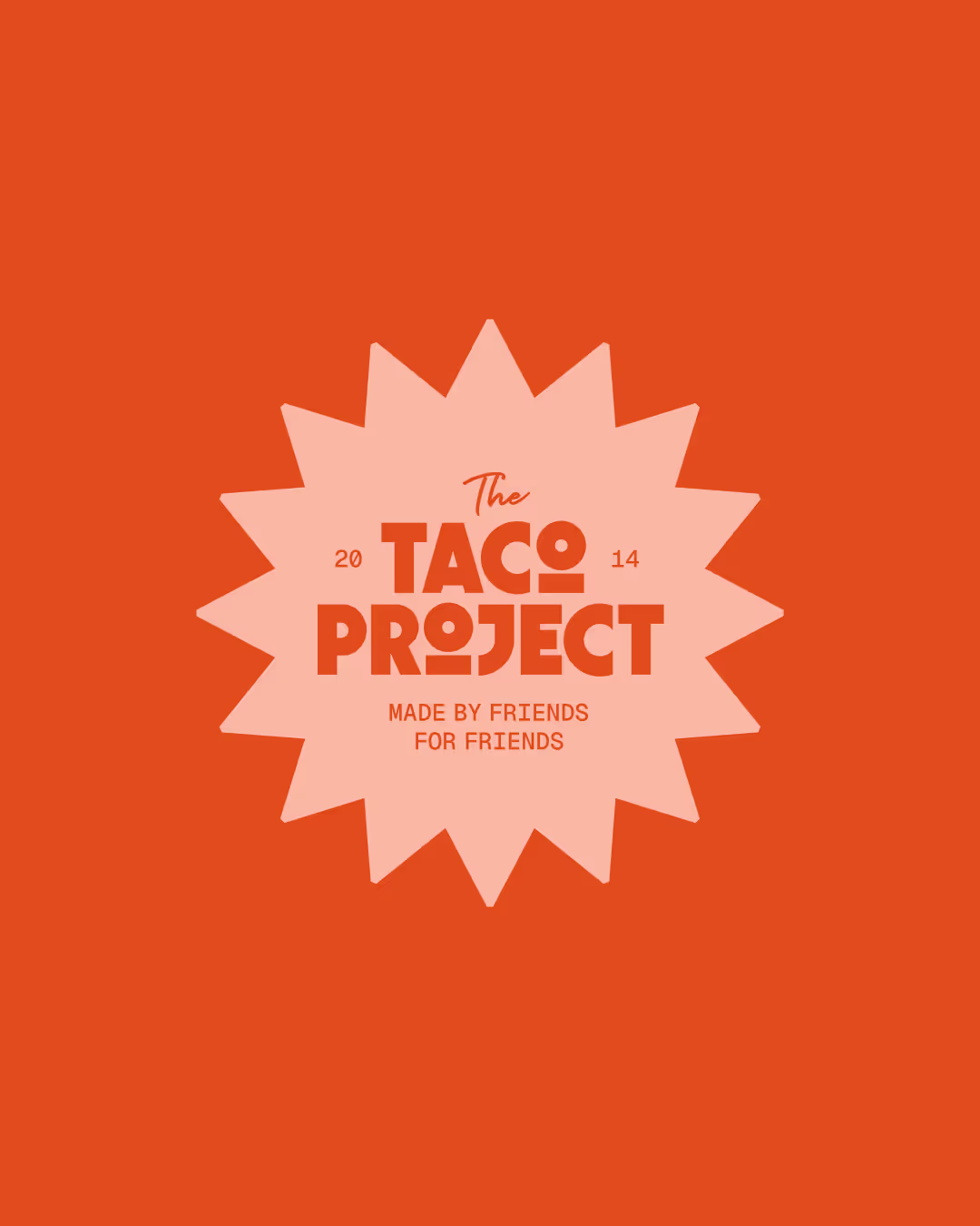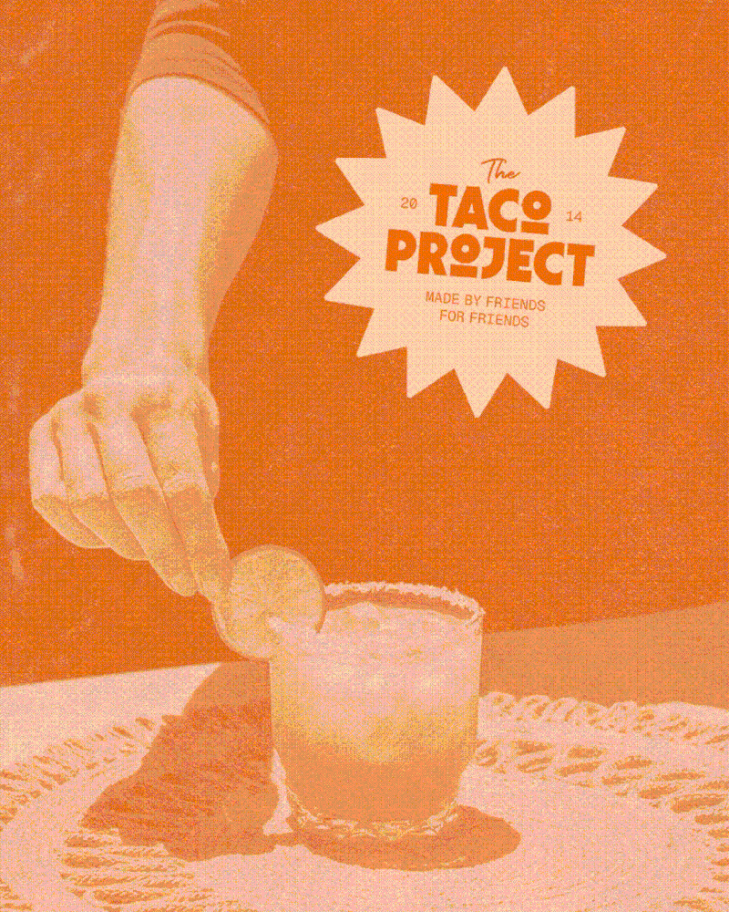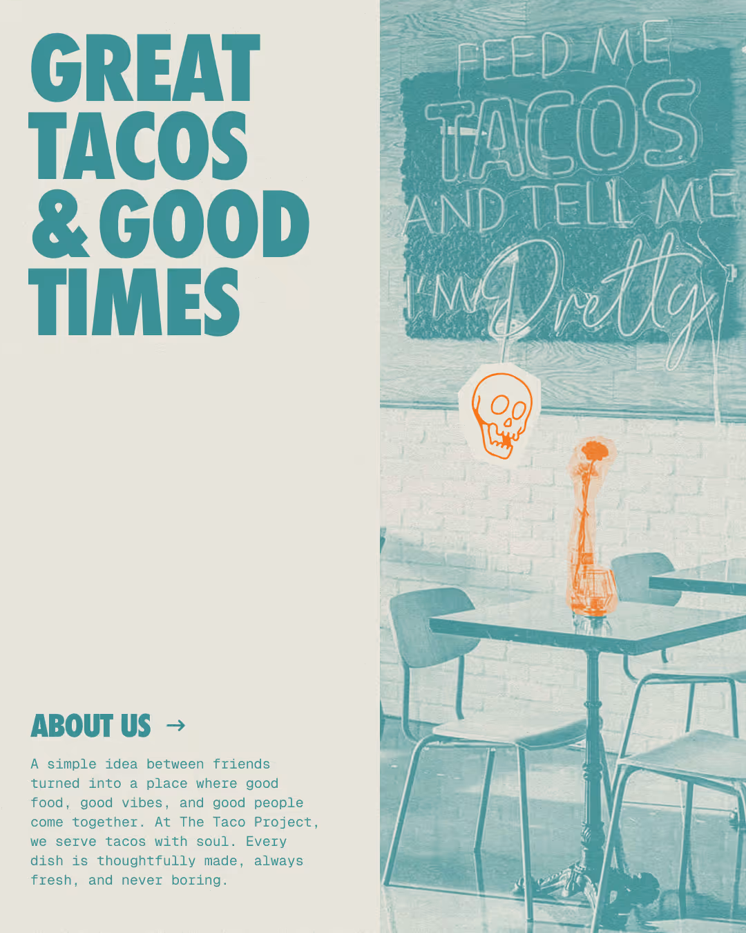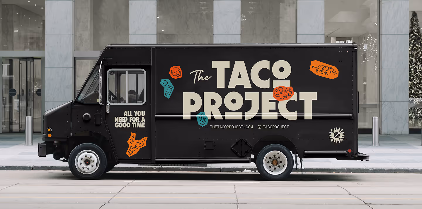
The Taco Project
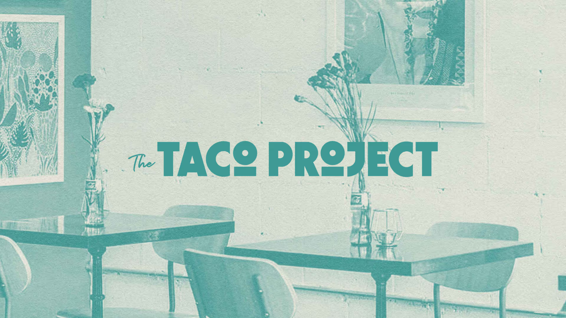
The Taco Project is a neighborhood taqueria turned community favorite. They came to us ready to embrace a fresh direction: bold, vibrant, and a little nostalgic.


Made for good times.
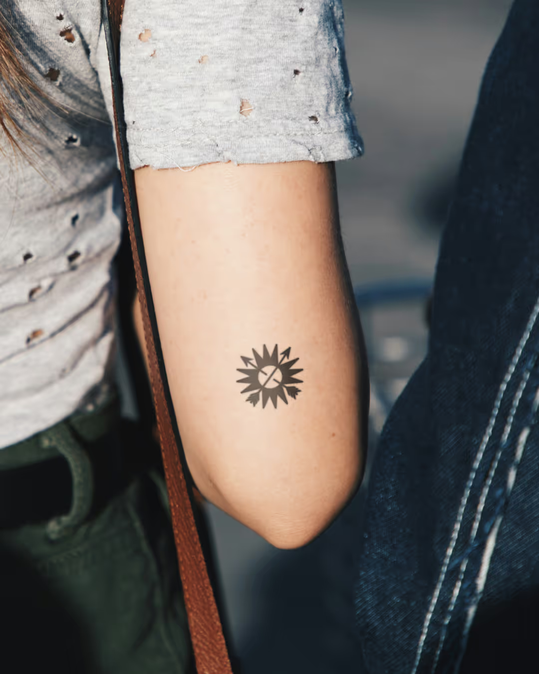
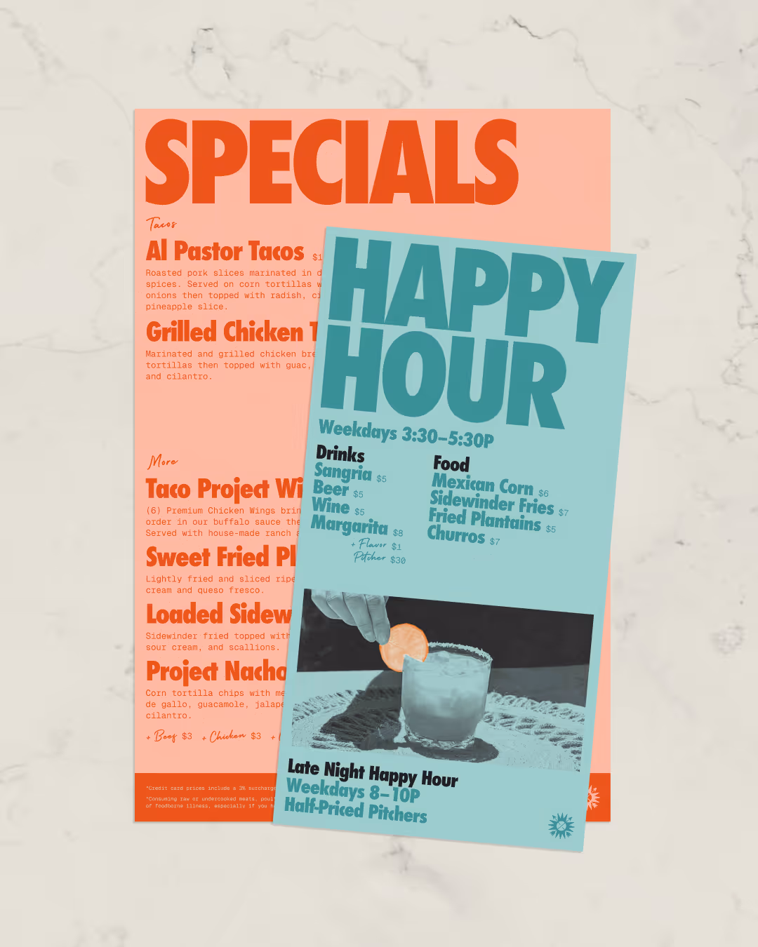
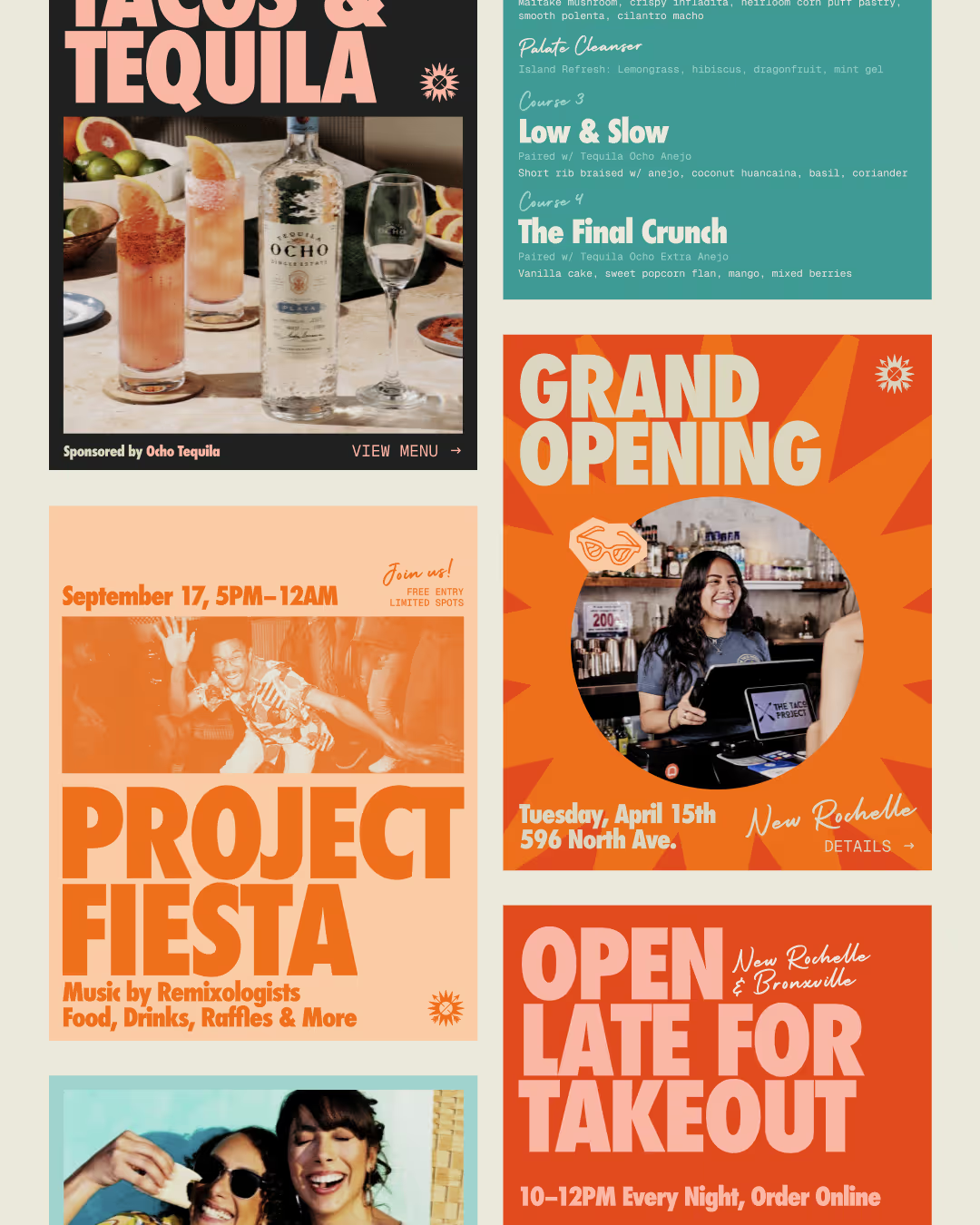
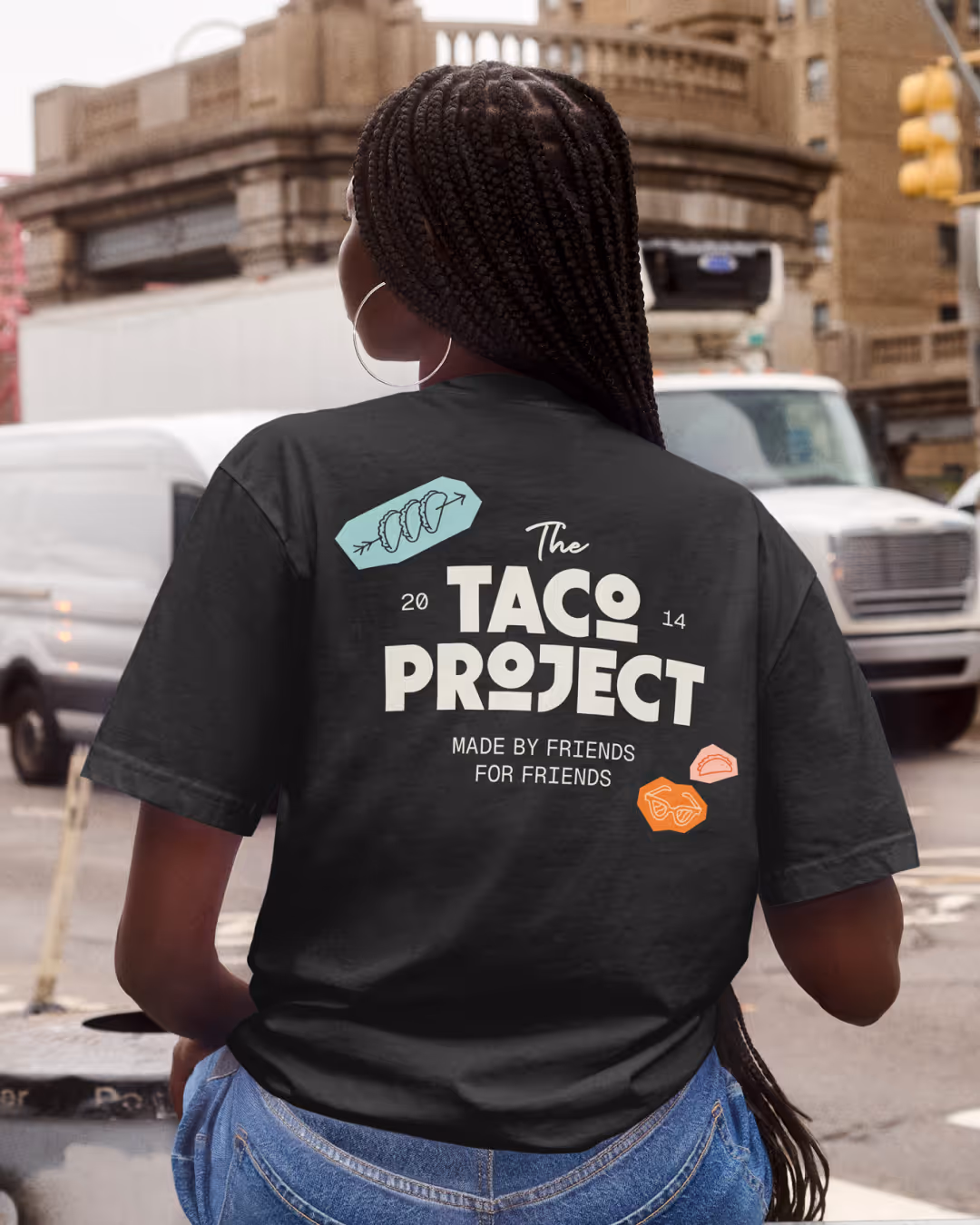
We crafted a custom wordmark that works as a stepping stone from their previous identity, a new icon inspired by sunshine and friendship, and an illustration set meant to evoke the energy of composition notebook doodles. A dynamic palette, timeless typography, and zine-inspired photo treatments round out a system that feels eclectic, fresh, and full of personality.
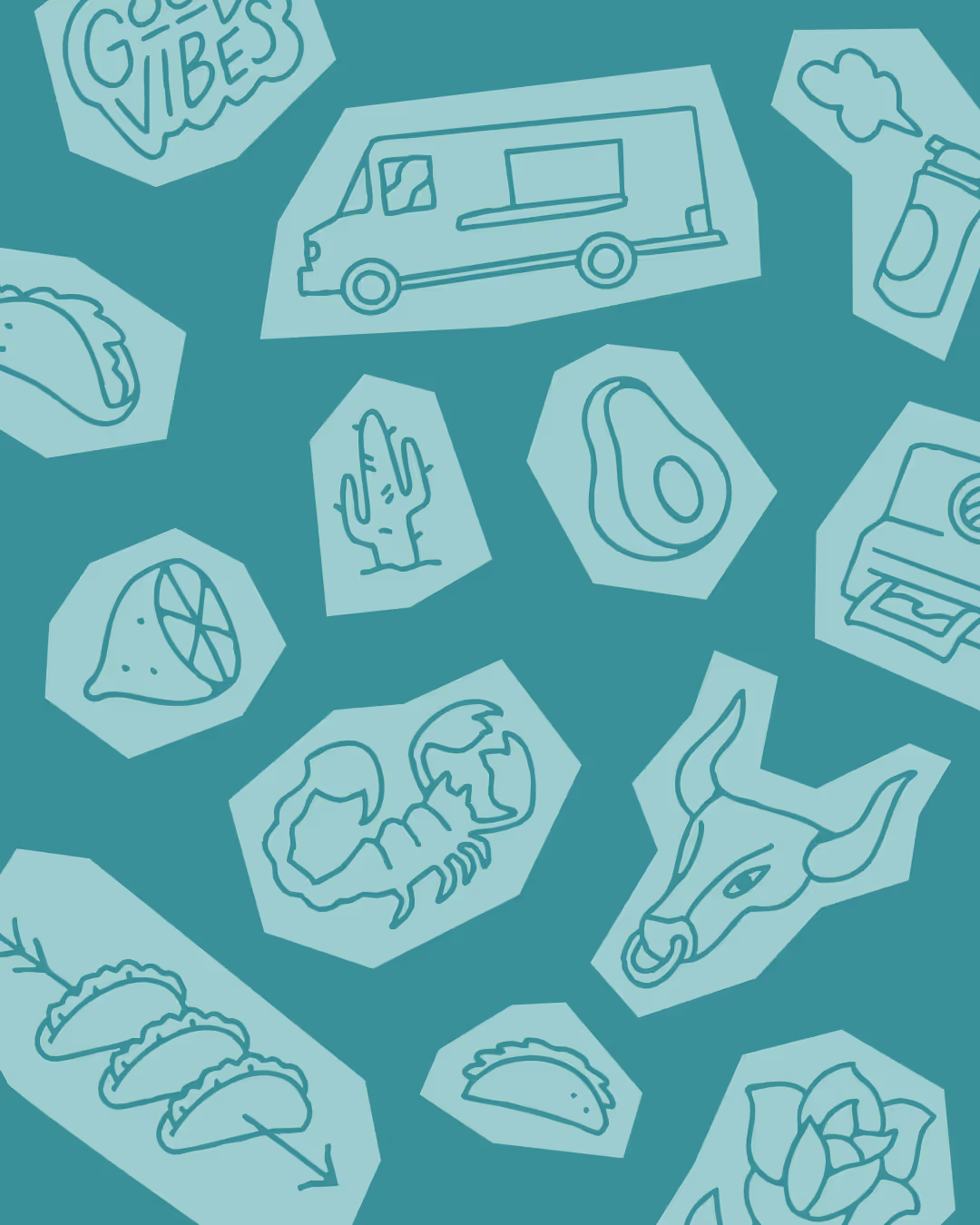
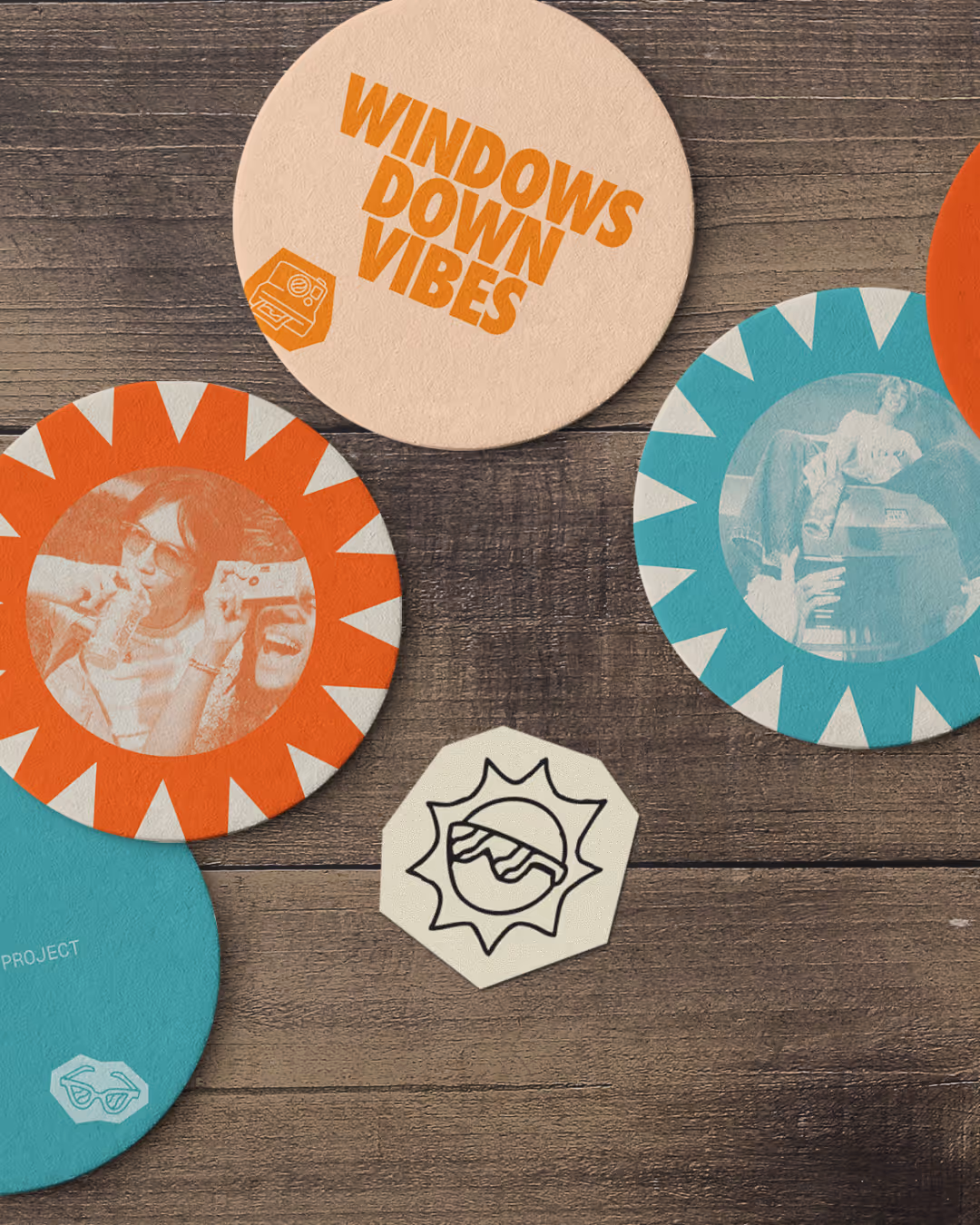
The 25-piece illustration set is not the entree of the brand, but rather the garnishes that enhance the brand as a whole. They are meant to add a bit of eclectic fun to our nostalgia-inspired brand. They add vibrancy and energy to structured typography and layout to bring the “casual” to the “polish”. They act like visual exclamation points, adding energy and charisma without ever taking themselves too seriously.
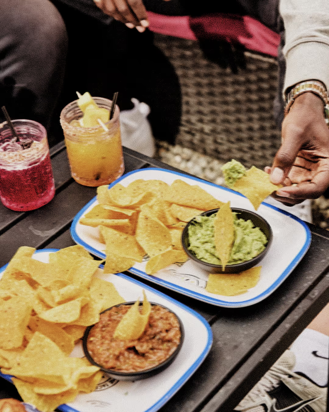
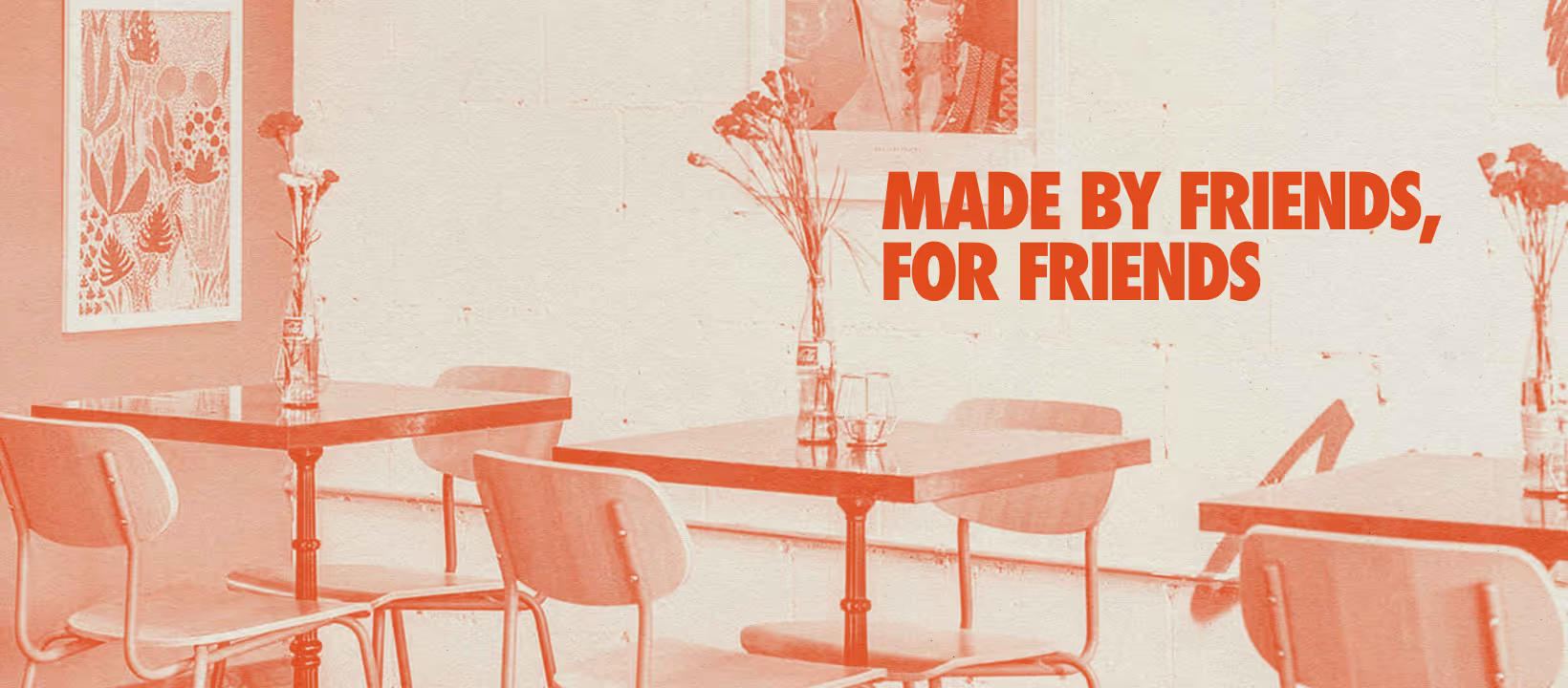
Our duotone treatment channels skate magazines and DIY zines, bringing bold color and a little rebellious spirit to the feed. With 15 color pairings, it’s flexible, eclectic, and able to create some particularly interesting pairings when used in the style of collage. When the focus shifts to food or the restaurant itself, our custom film effect steps in. This effect is a grainy, timeless treatment inspired by old cameras that keeps the brand unified, warm, and human. Together, they create a visual rhythm that feels as dynamic as The Taco Project community itself.