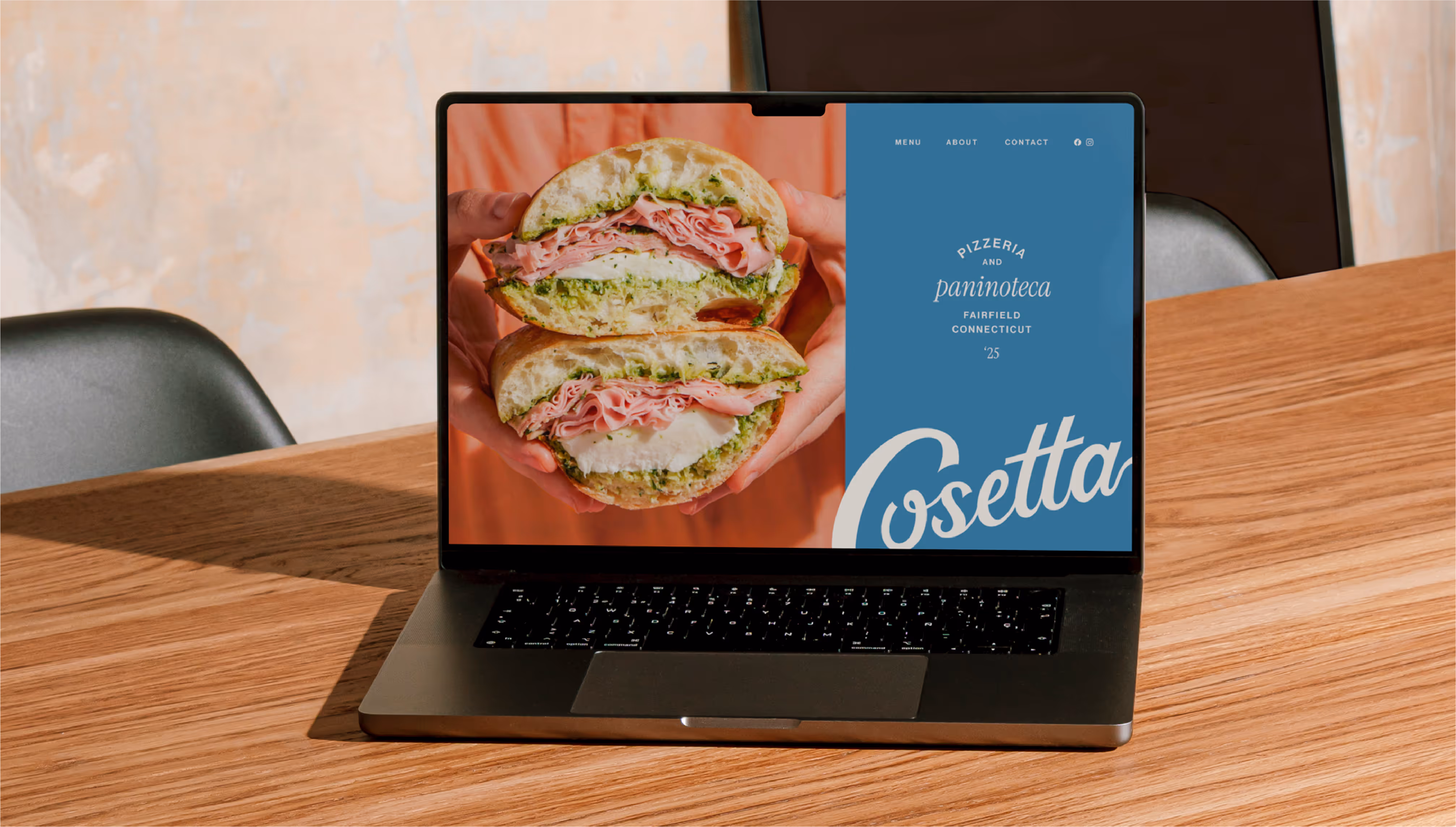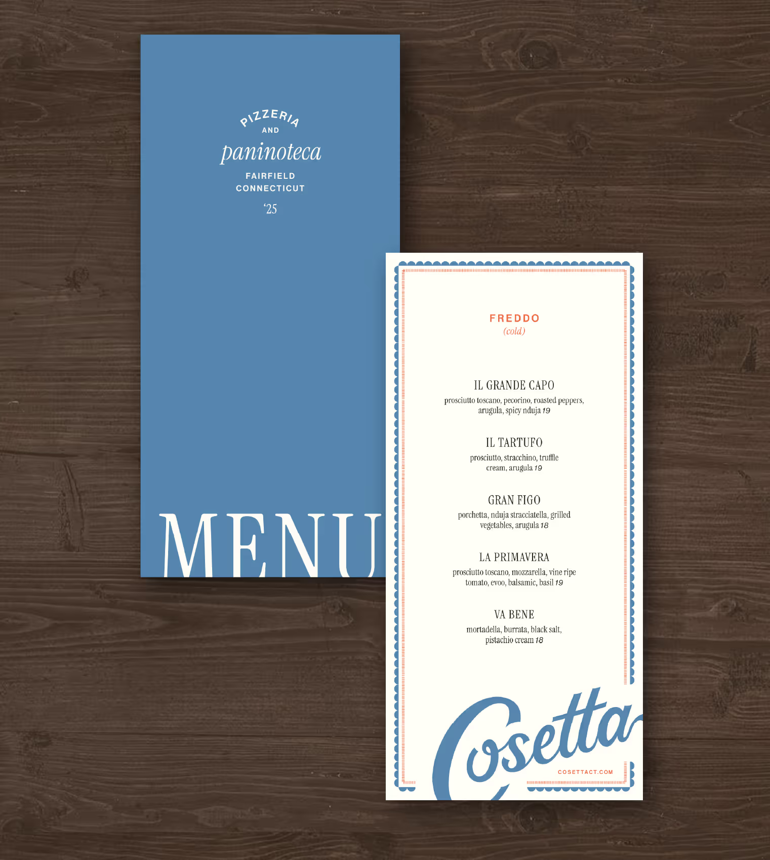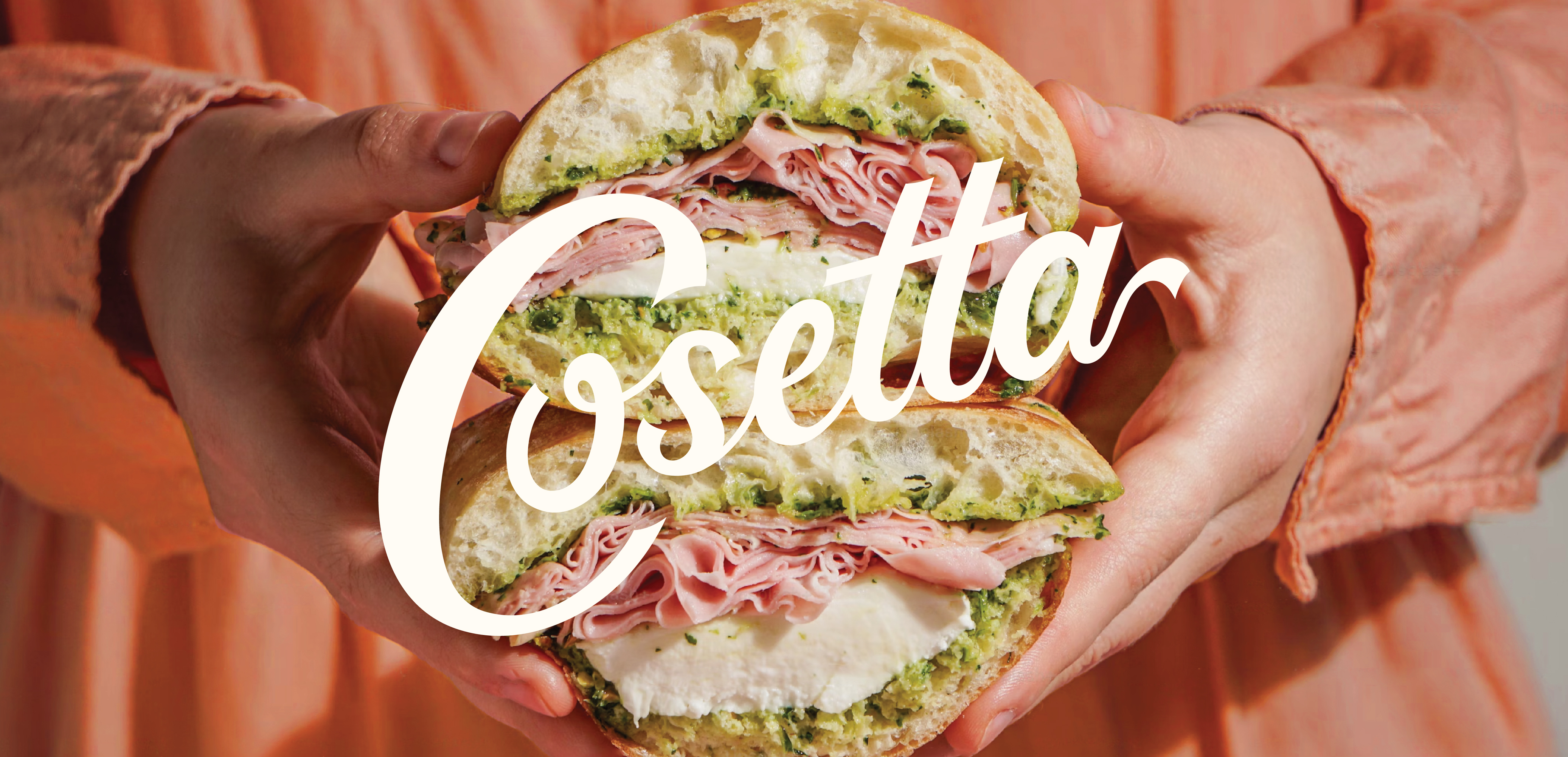
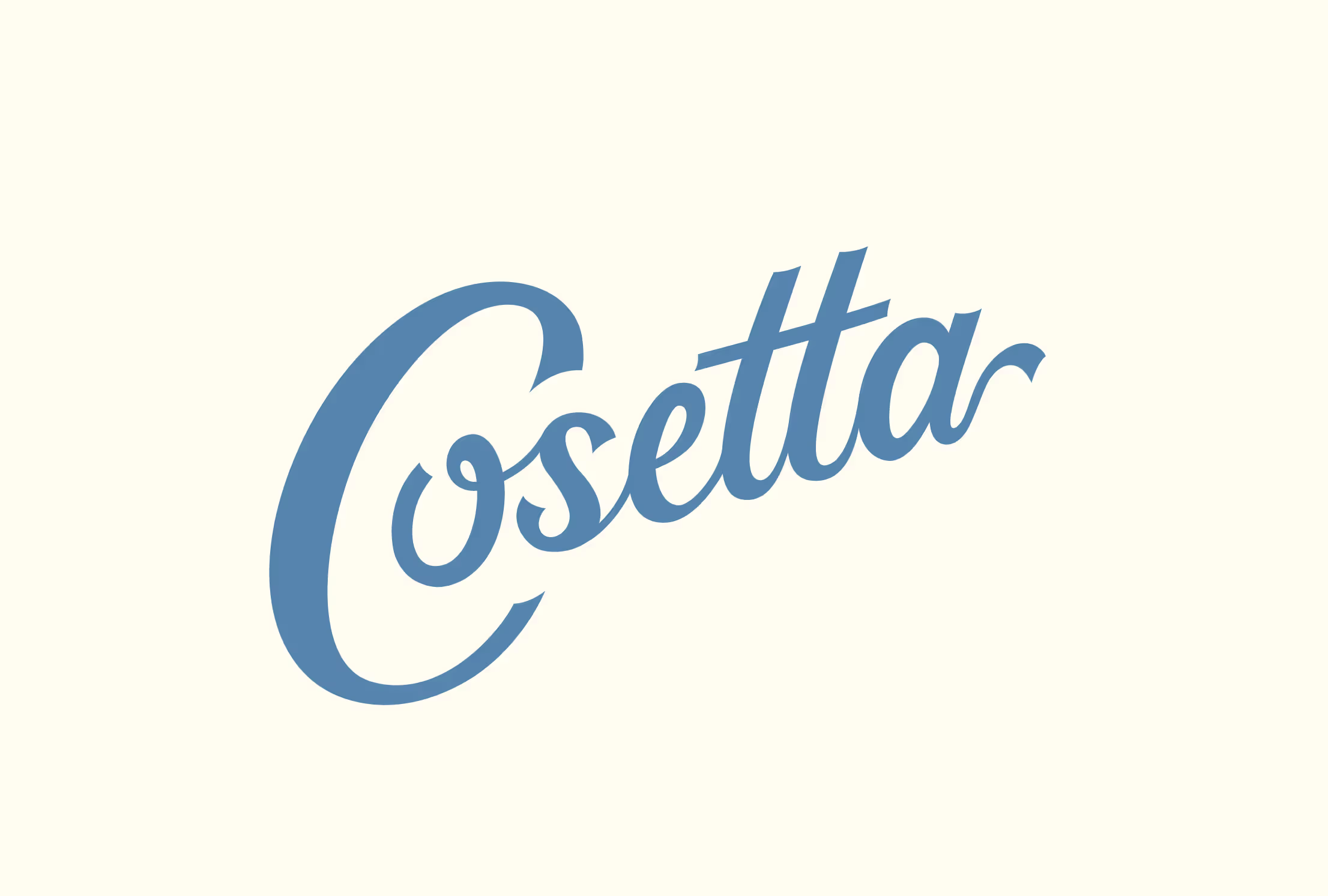
Cosetta
Bringing the warmth of a neighborhood paninoteca, the artistry of a classic pizzeria, and the comfort of a cup of espresso—all in the heart of Fairfield.

Classic artistry
The brand identity for Cosetta was designed to capture a modern expression of classic Italian food culture. It feels timeless and approachable, with a quiet confidence that reflects the care behind the menu. Rather than relying on expected visual cues, the identity avoids the typical red-and-green palette and leans into a more restrained and sophisticated look. The name Cosetta, which means “little thing” in Italian, sets the tone—suggesting detail, charm, and an appreciation for life’s small pleasures.
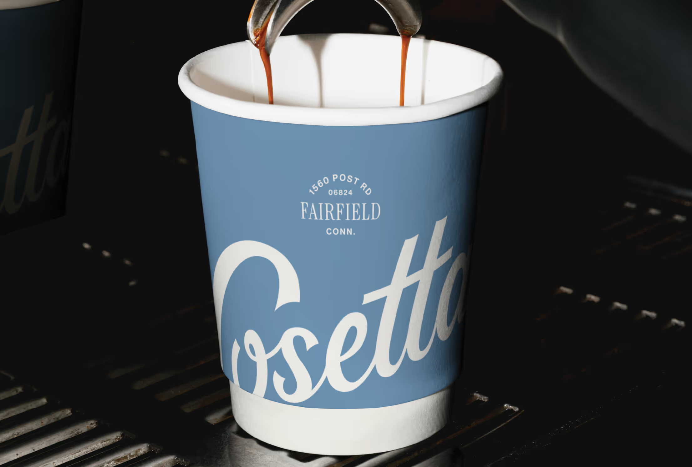
Typography plays a key role in expressing this balance. A refined serif paired with a clean, modern sans serif gives the brand structure and softness at once. The custom script feels familiar and well-established, while still fresh and youthful. The system draws from tradition but speaks to today’s Fairfield—classic and effortlessly chic.
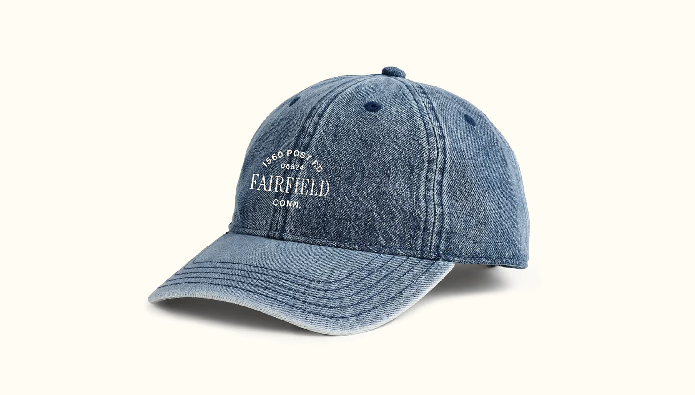
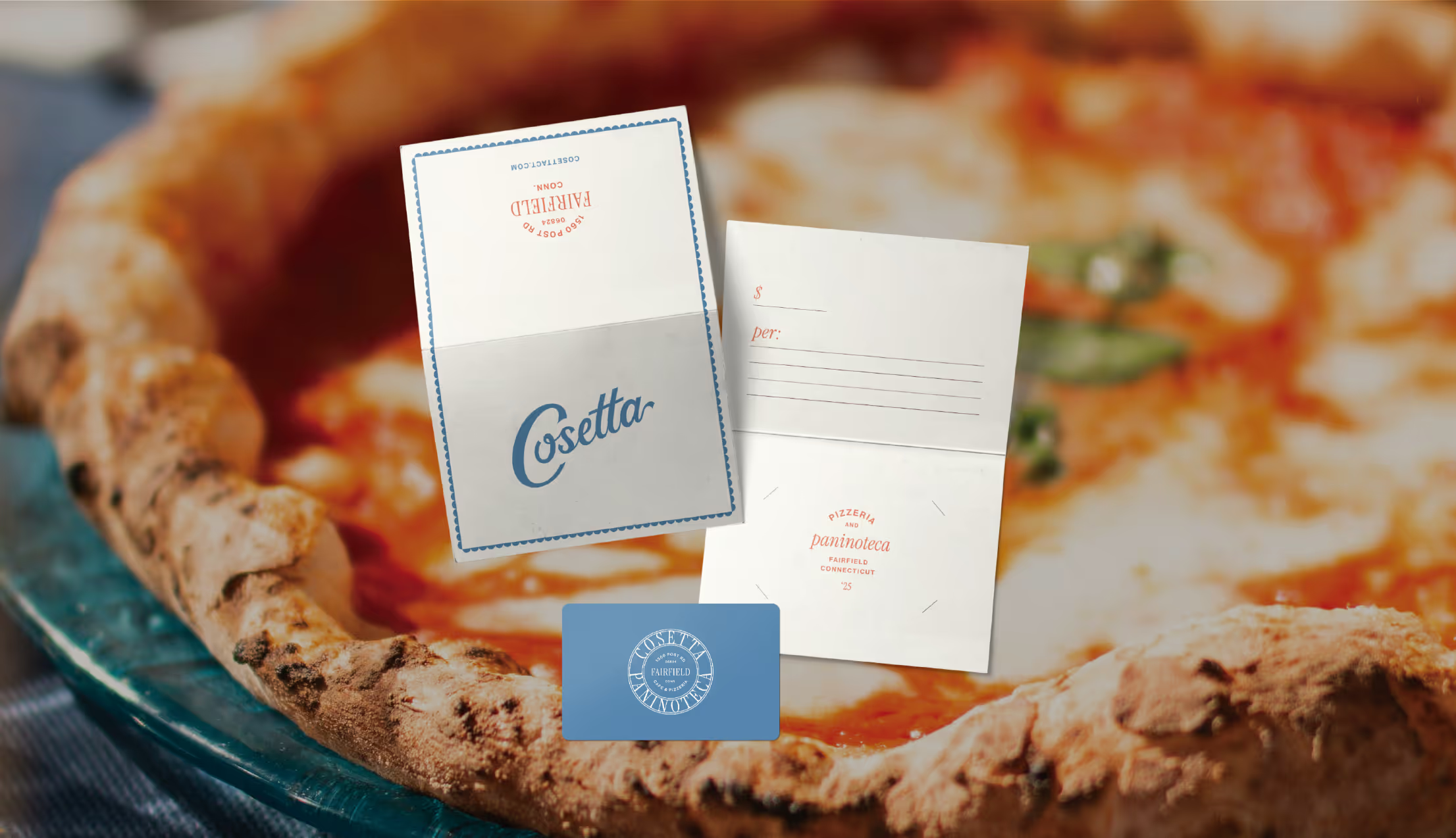
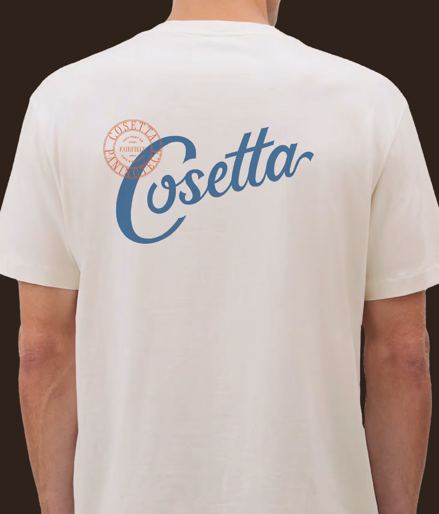
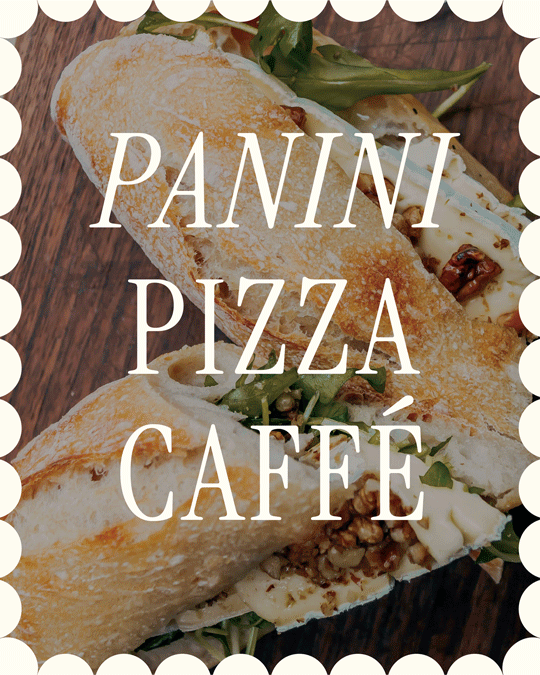
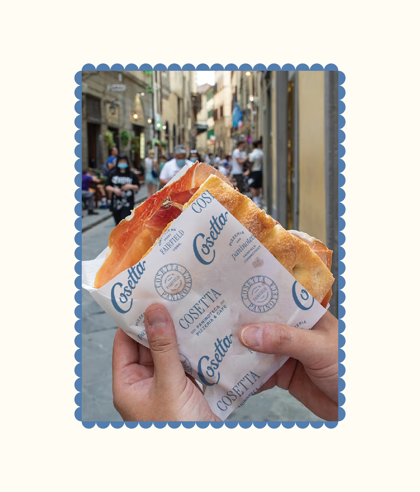
The brand’s presence extends beyond the shop through its distinctive packaging. Bold, typographic treatments on coffee cups, sandwich wraps, and pizza boxes turn everyday items into walking brand moments. Whether someone is carrying a slice down the sidewalk or sipping espresso on the go, the design is meant to catch the eye—inviting curiosity, recognition, and a sense of style that feels both modern and rooted. It’s branding that moves with people, becoming part of the daily rhythm and street life of downtown Fairfield, CT.