Hubspoke Kitchen
Six restaurants, one kitchen, endless options.


Food for every mood.
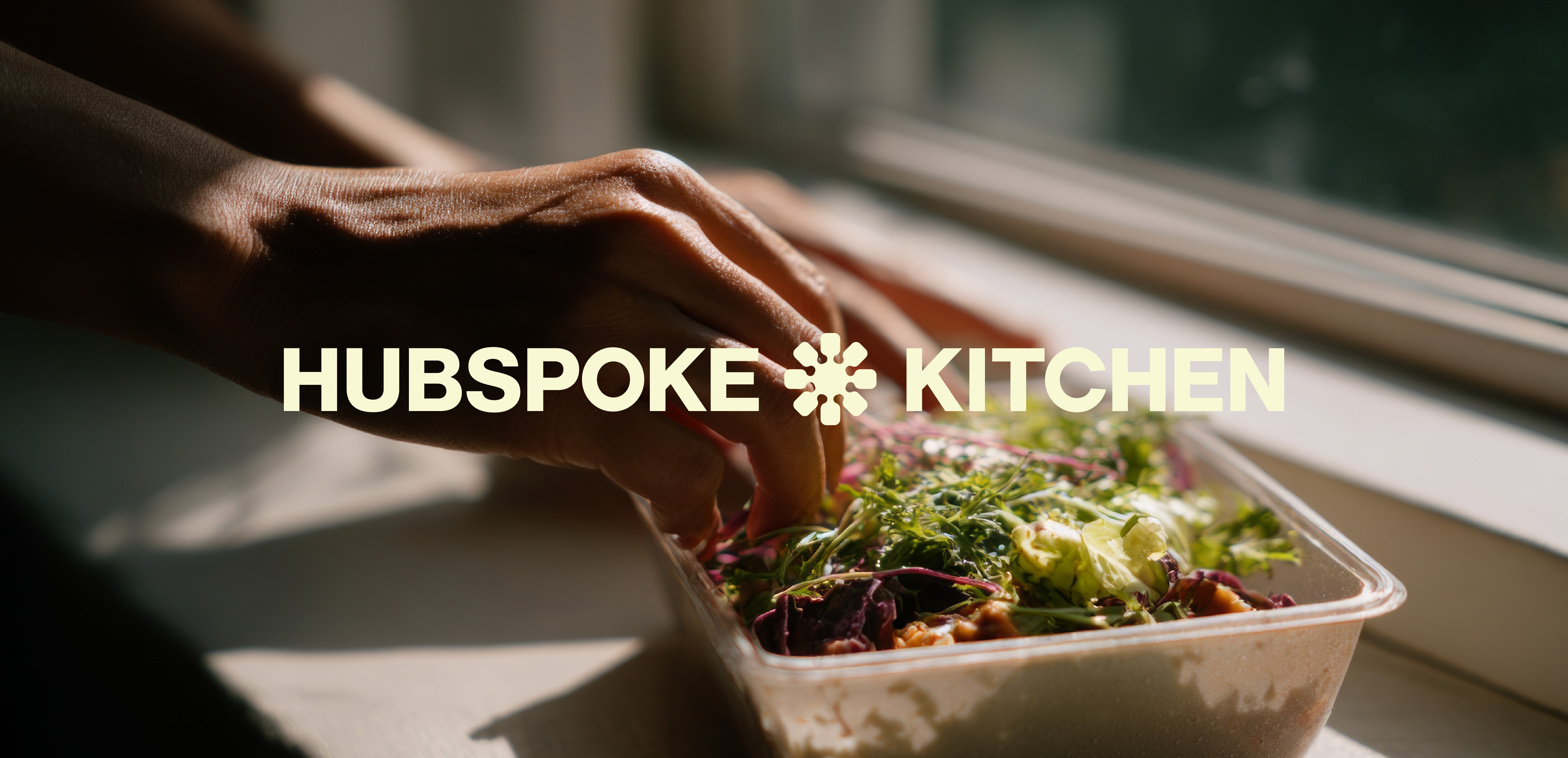
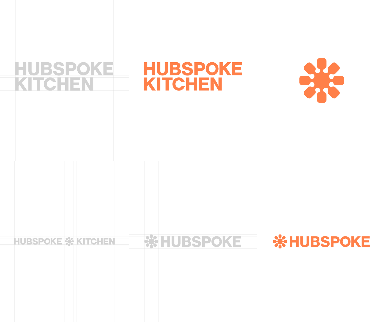
When Hubspoke Kitchen asked us to refresh their brand, we started with the centerpiece: a custom logo mark designed to be timeless, versatile, and representative of choice.
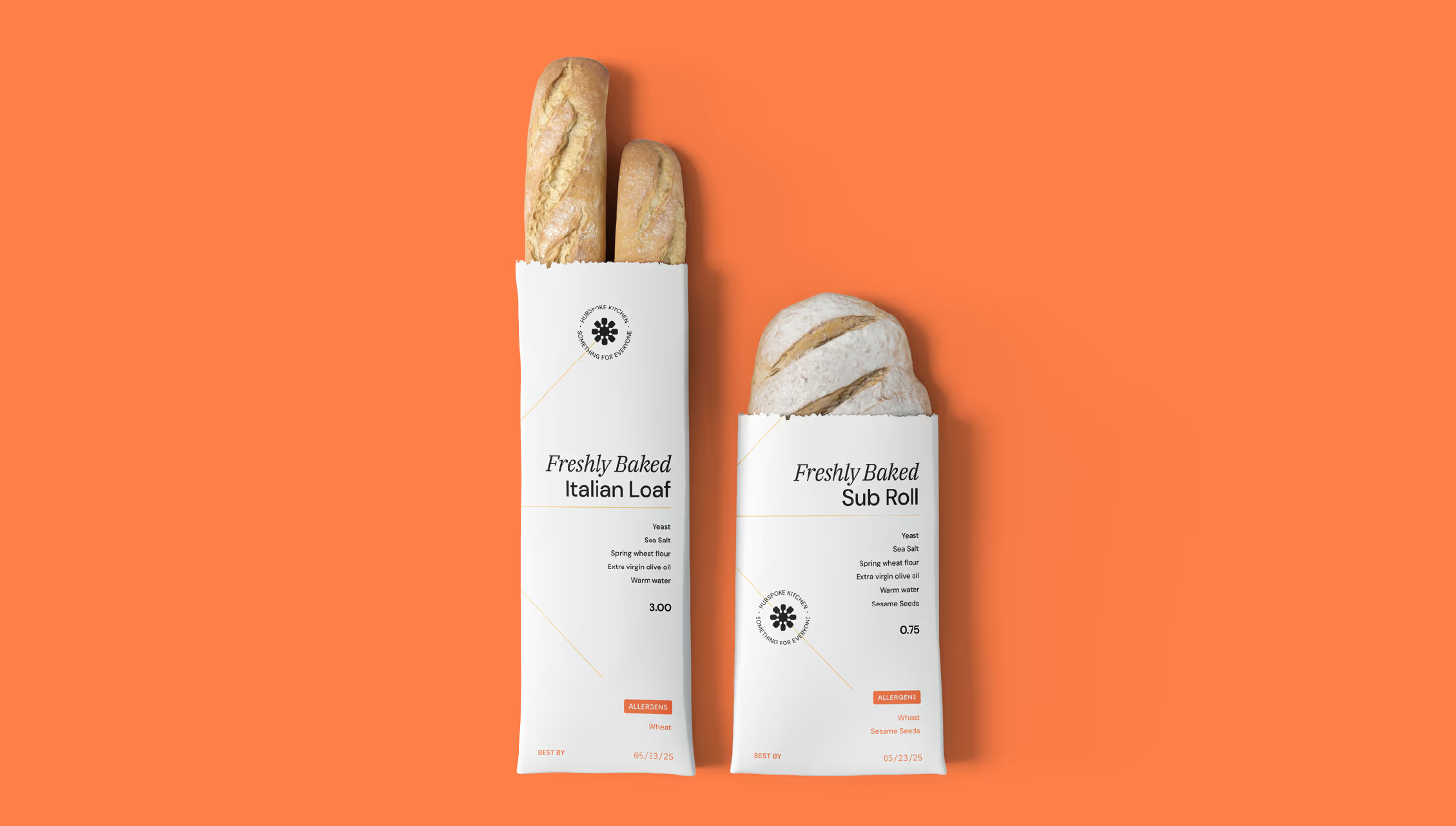
At first glance, it’s a hub and spokes. Look closer, and you might see the warmth of the sun, the vitality of a flower, or even the tools of the kitchen. Paired with a bright, heroic orange, the mark became an approachable symbol of connection, growth, and everyday enjoyment.
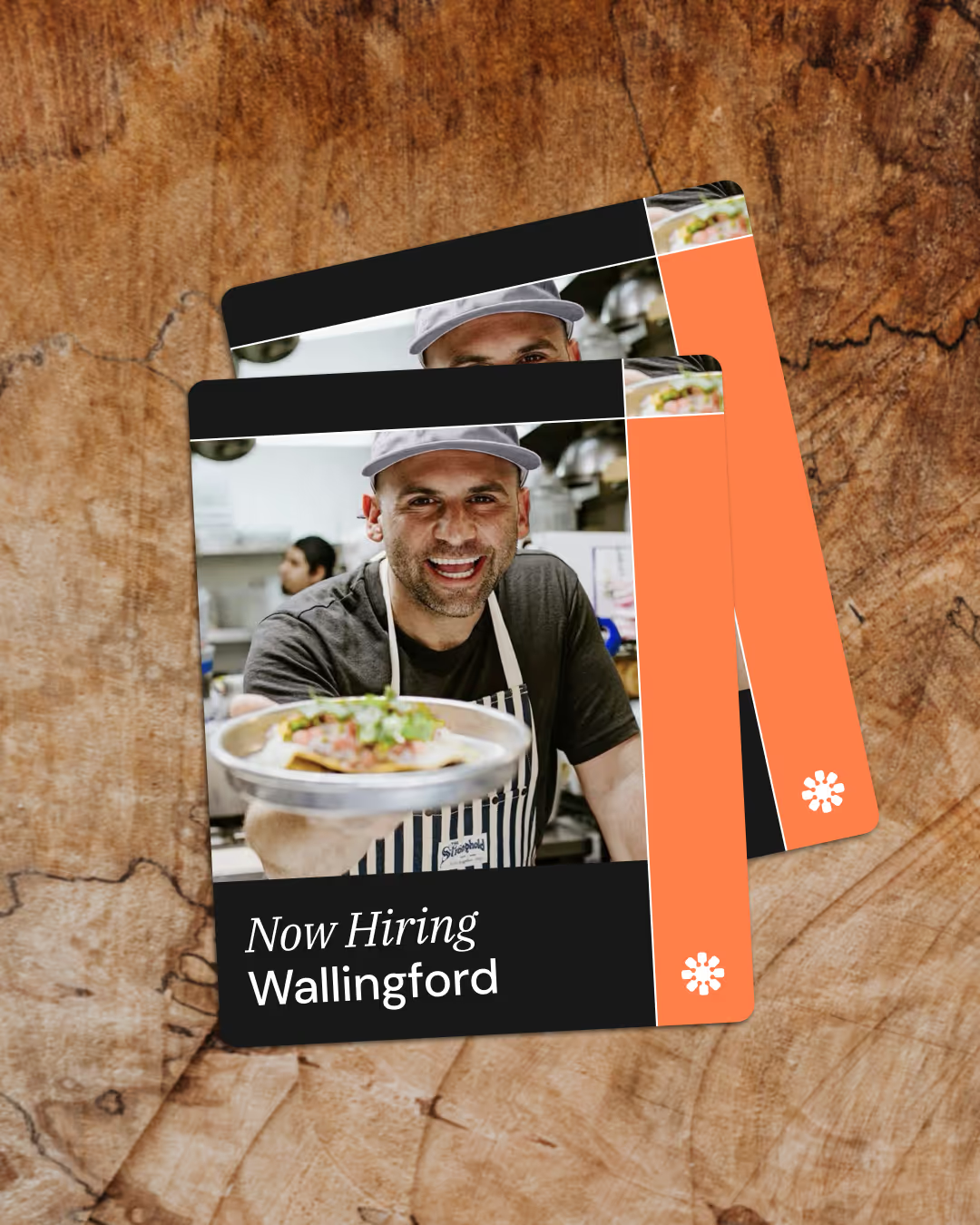
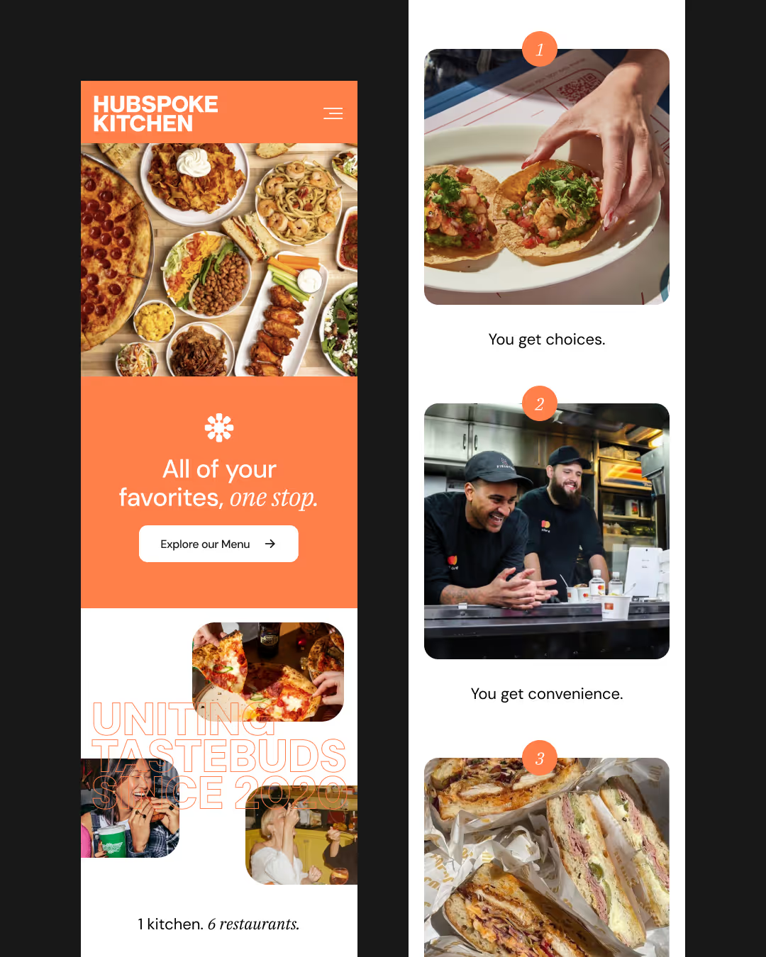
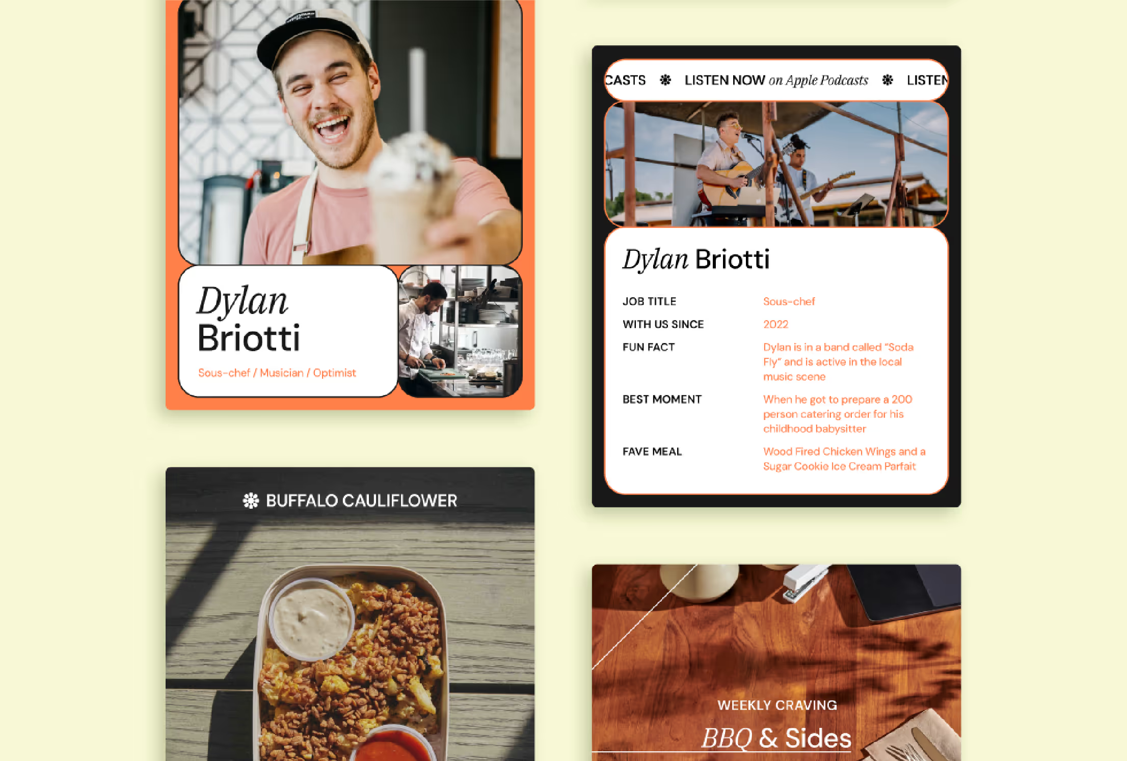
To pair with this versatile logo mark, we built an overall system that could unify all of Hubspoke’s sub-brands under a single roof. We expanded the logo mark’s radial structure into a flexible design system that carries across packaging, print, and digital touch points. This framework symbolizes both variety and connection, giving Hubspoke the ability to house six distinct restaurants (including the nationally loved Wayback Burgers) while still standing strong as its own identity. To bring the brand into a digital space, we equipped Hubspoke with the tools to show up with the same warmth and confidence you feel in-store.
