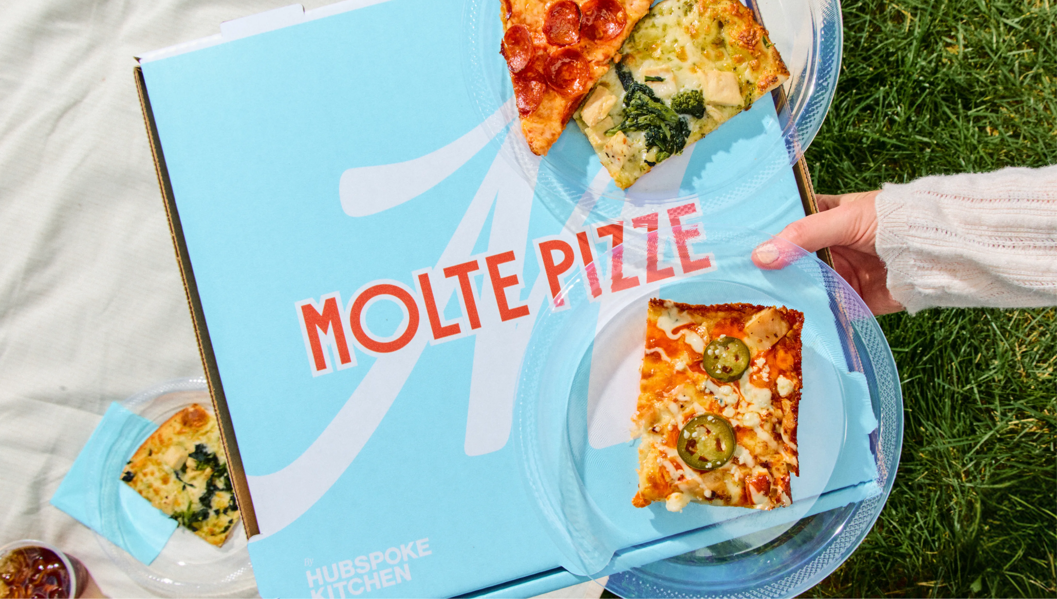
Molte Pizze
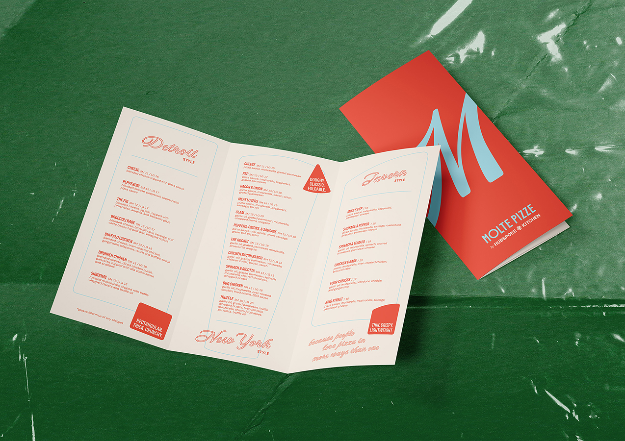
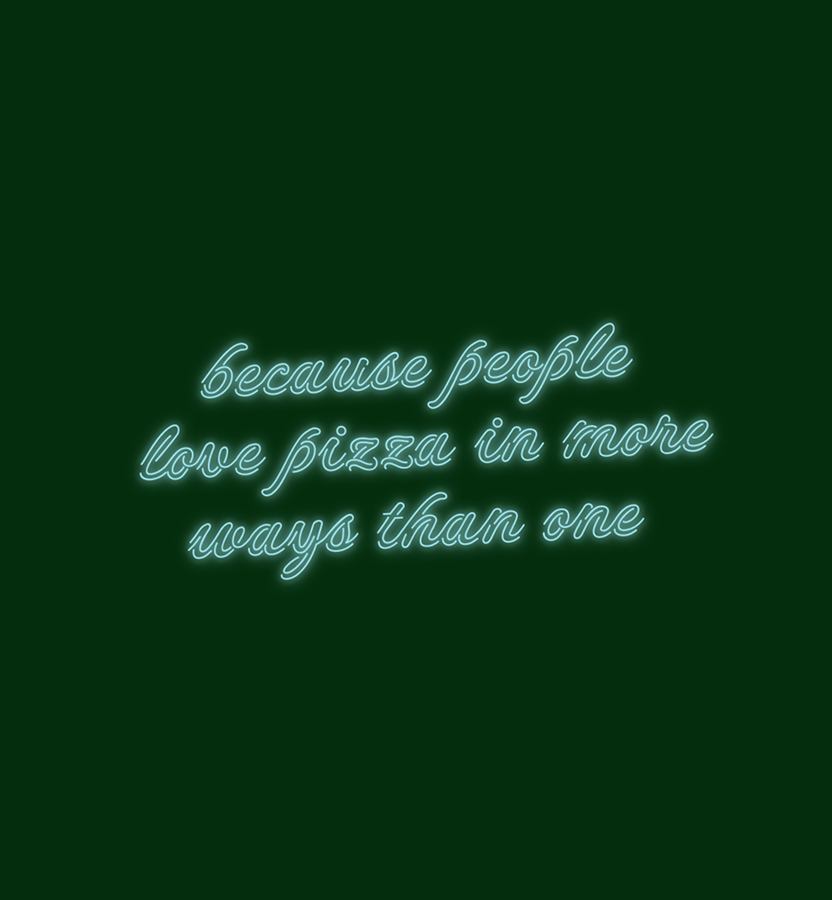
Molte Pizze began with a simple truth: people love pizza in more ways than one.
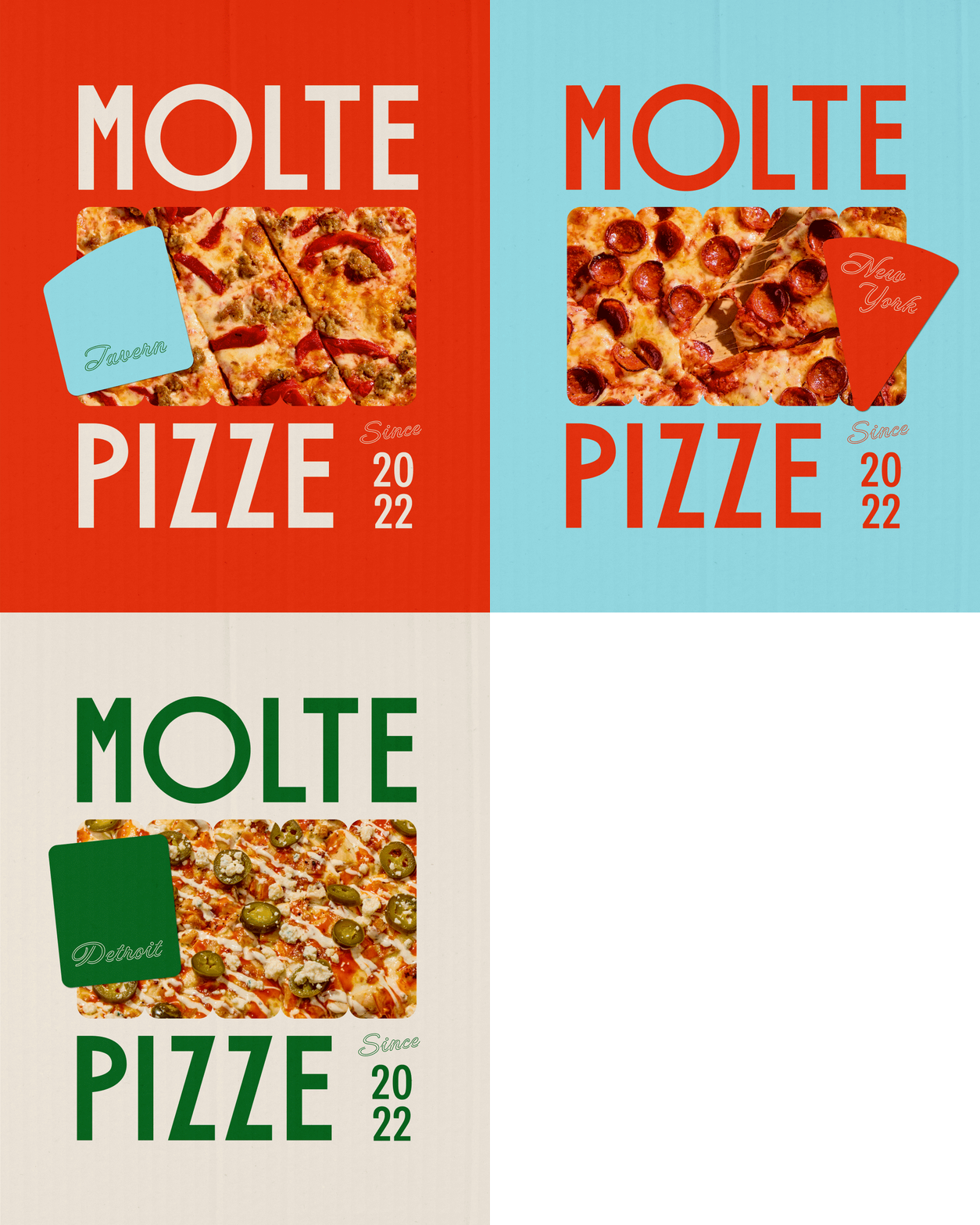
Three styles, one roof
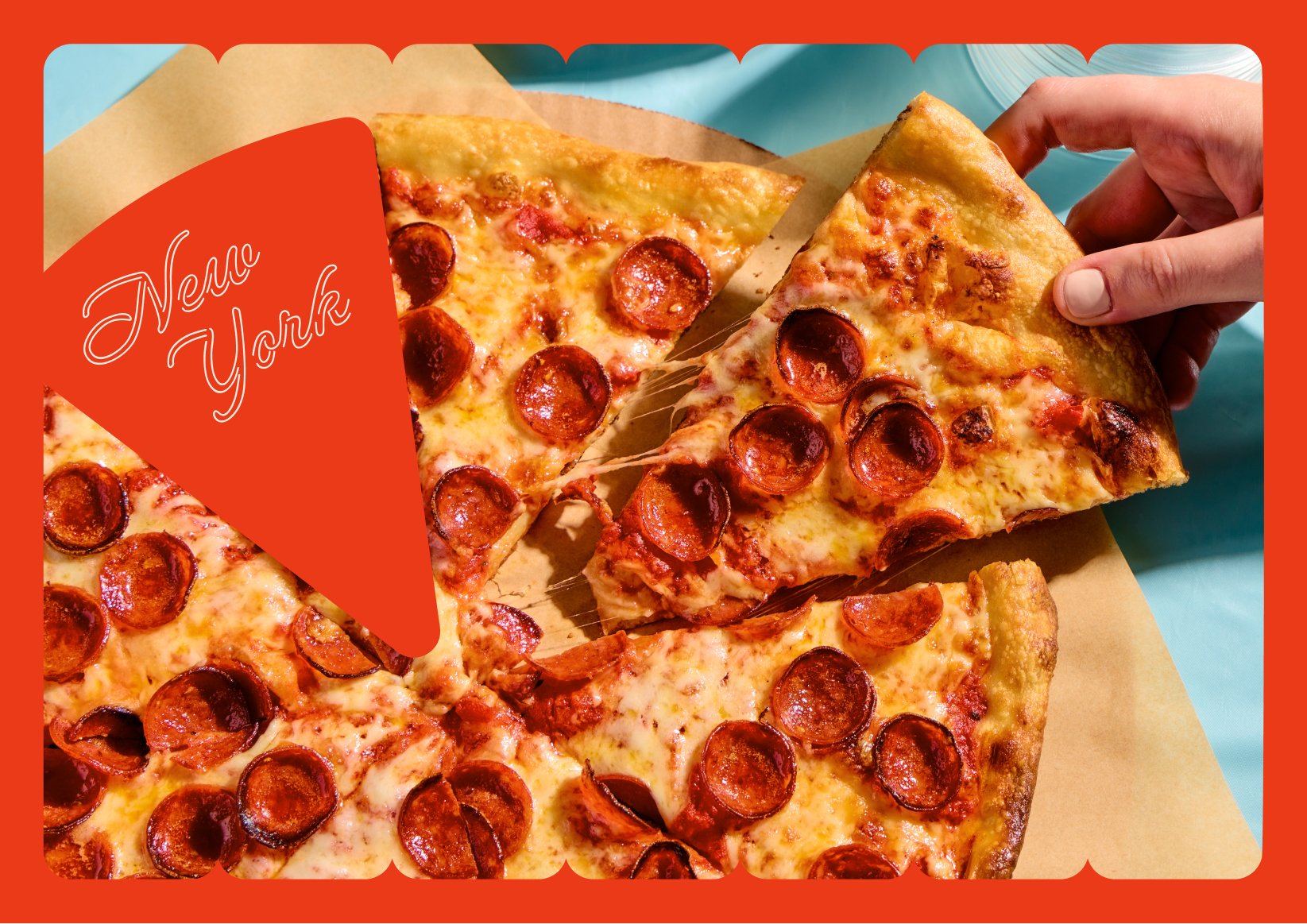
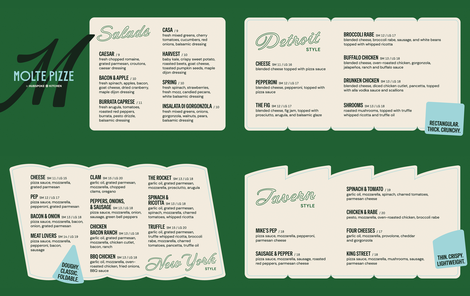
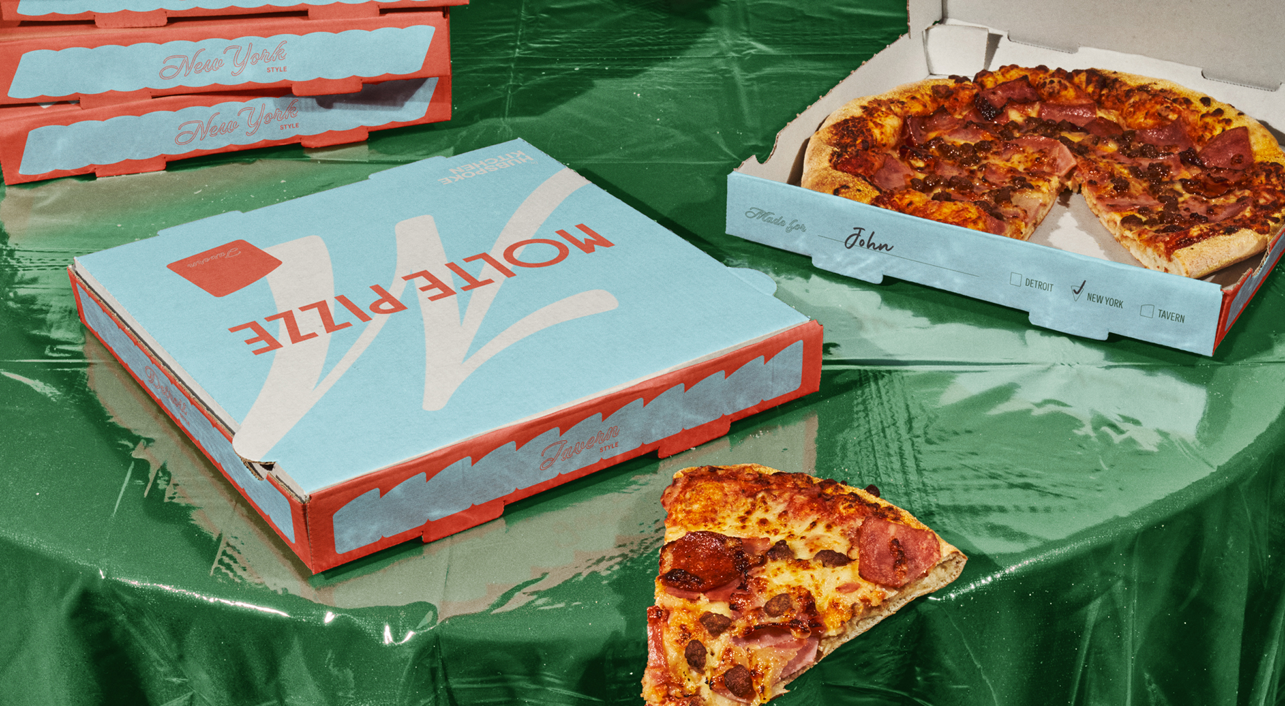
Created by the team at Wayback Burgers, Molte Pizze is a new pizza concept that brings Detroit, Tavern, and New York-style pizza together under one roof. Molte literally translates to “many” in Italian, so we embraced that variety—which is Molte’s biggest differentiator—and made it the celebratory point of focus in the identity. Wayback’s goal was to build Molte Pizze as their flagship pizza concept that could eventually be offered to franchisees and scaled into new markets. That meant the brand had to solve a unique tension from the start: compete with beloved local pizza shops while still operating with the consistency and structure of a national franchise.
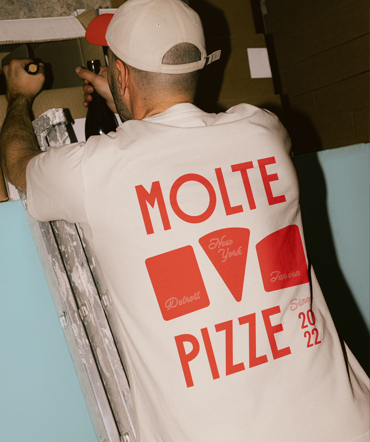
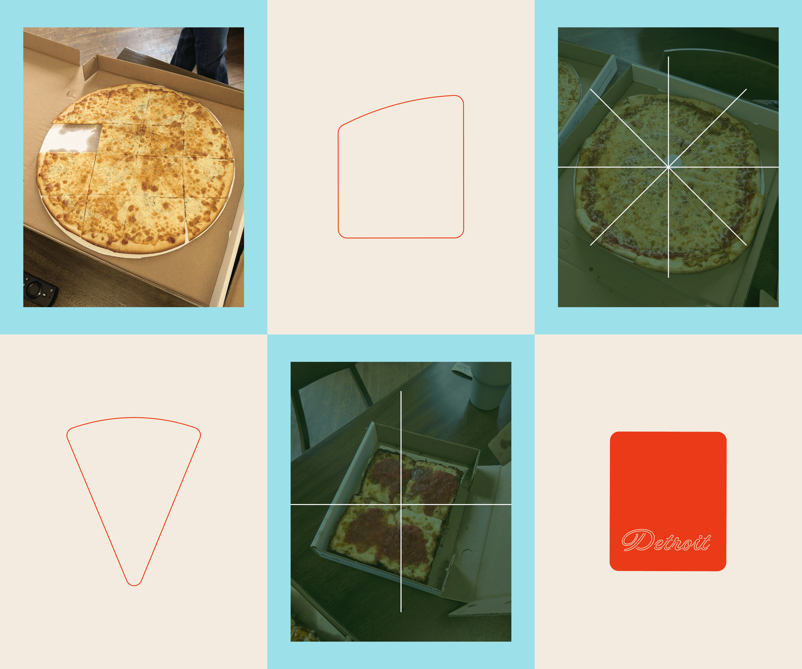
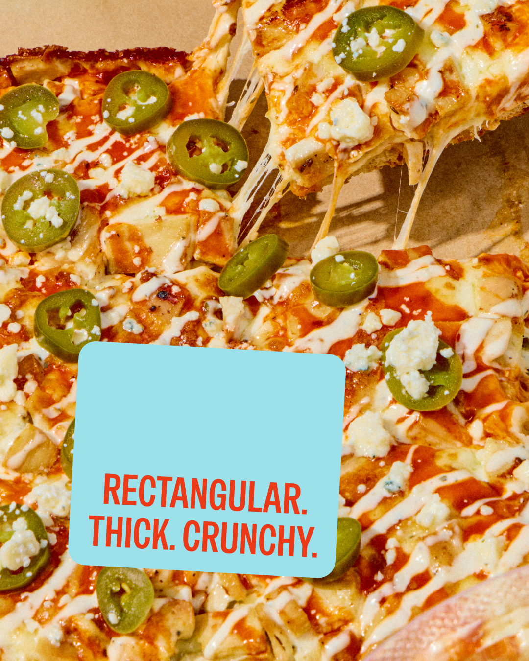
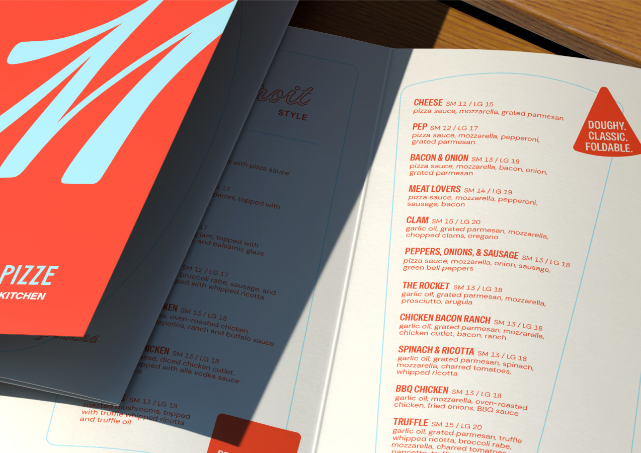
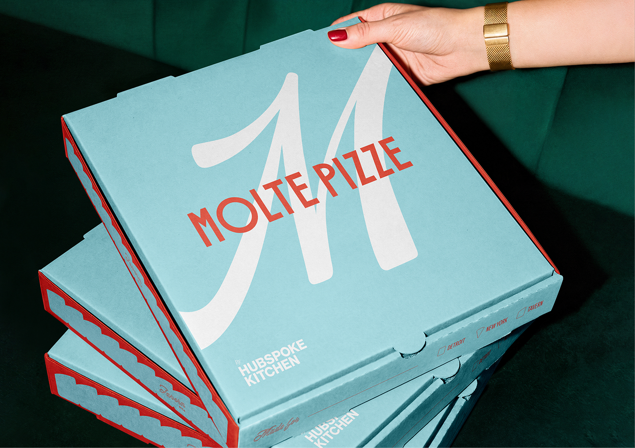
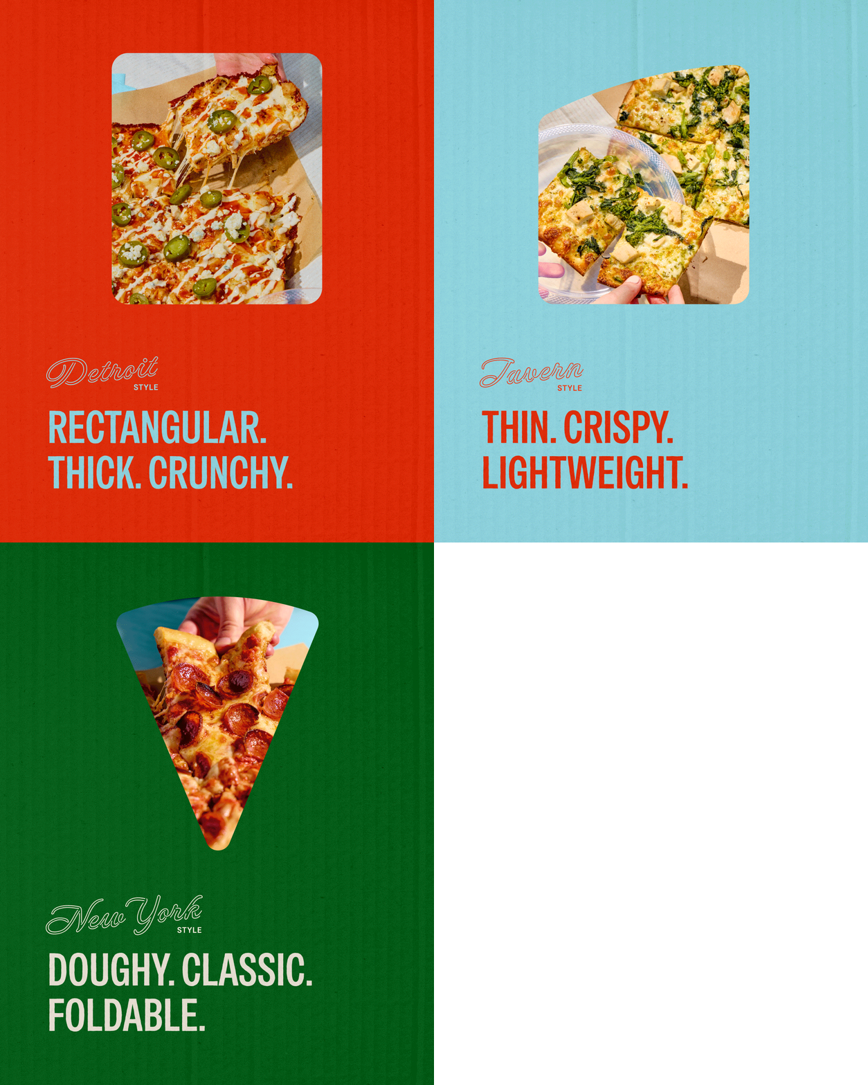
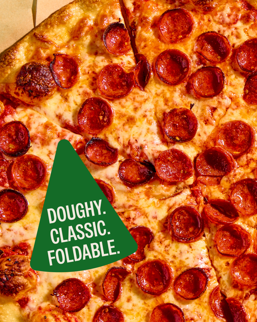
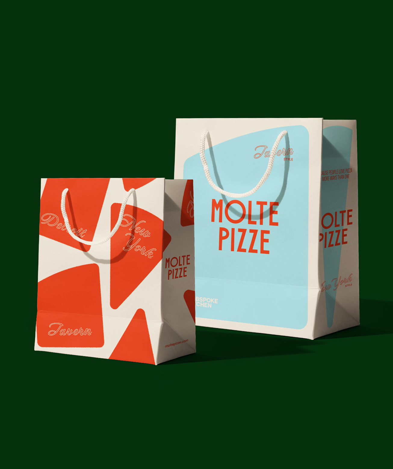
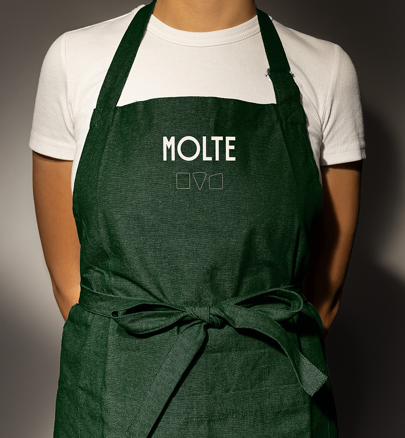
To understand what Molte would be up against, we studied independent pizza brands in the markets where the concept would launch. While many lacked a polished or cohesive visual system, they often had something much harder to manufacture: personality. Their quirks, imperfections, and individual character helped them feel unmistakably local. Rather than imitate the visual inconsistency of those businesses, we identified the quality worth borrowing. We needed to give Molte enough personality and unexpectedness to feel at home among local favorites, without reading immediately as a chain, and build a system that could scale across locations, franchisees, packaging, signage, and future markets. We started with a primary word mark inspired by Italian lettering, where varying letter widths introduce variety within a unified form. From there, we looked directly to the product to create a visual language unique to Molte. Each pizza style produces a different “slice geometry” (as we coined it), so we reduced those forms to three simple shapes which became the foundation of the graphic system. Used individually, they identify pizza styles, communicate attributes, and create flexible containers for information. Multiplied together, they become energetic patterns that can wrap packaging, frame content, or expand into bold graphic moments. The result gives each pizza its own visual shorthand without separating it from the larger system.
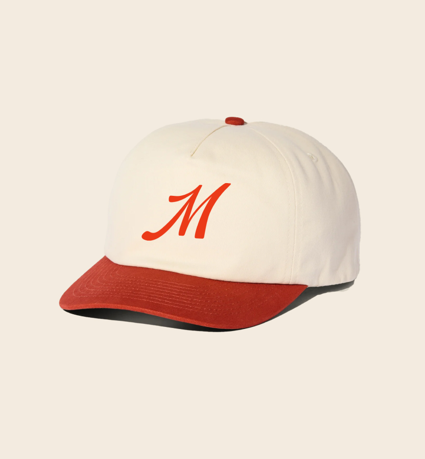
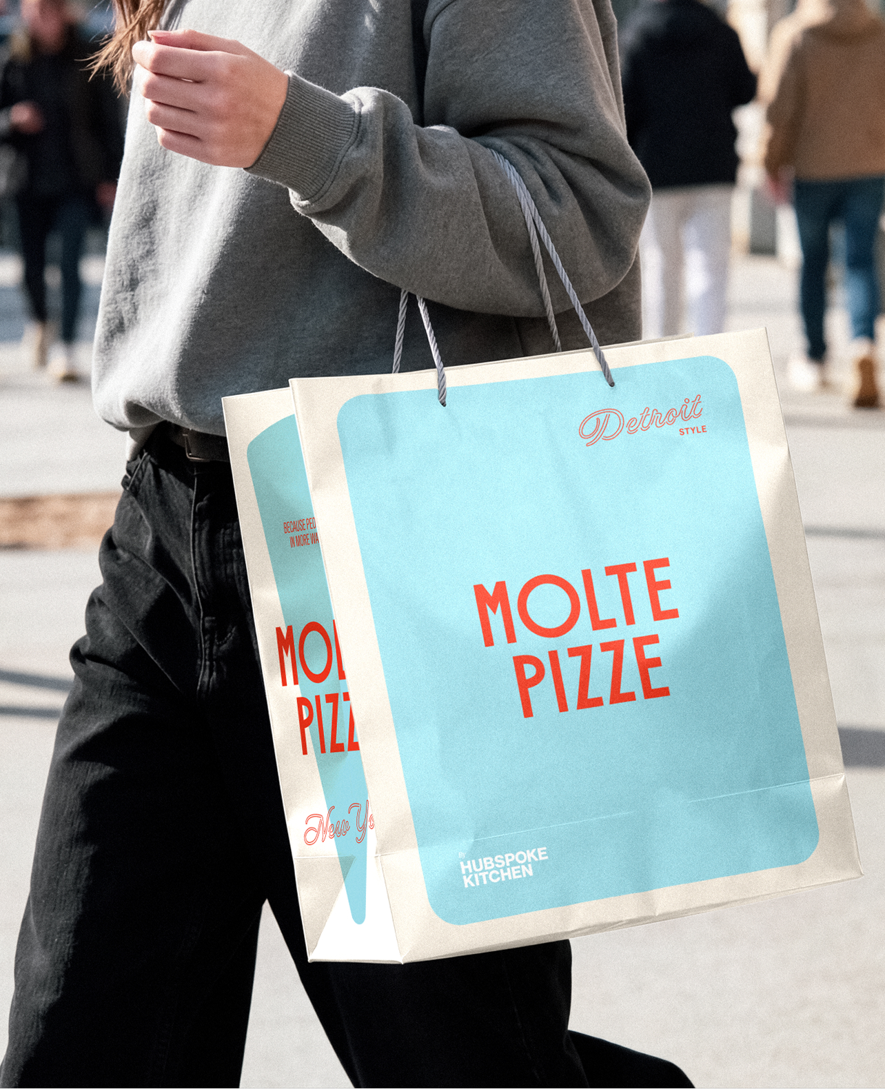
That same balance of variety and cohesion carries through the rest of the identity. We gave Molte a punchy, unexpected color palette to emulate the individuality of an independent pizza shop, while a tightly controlled system gives the brand the consistency required for franchise growth. A neon-inspired typeface recalls the glow of familiar neighborhood pizza joints, while a contrasting script mark introduces warmth and Italian-American character. The combination of these elements make Molte feel as if it were always there, which supports our biggest challenge of converting local loyalists into Molte fanatics. Together, those elements allow the brand to feel fresh, playful, and distinctive without losing the familiarity people expect from local pizza. The result is a bold, flexible identity that turns Molte’s biggest selling point into its greatest brand asset: many styles, many preferences, and many ways to love pizza, held together by one cohesive system that was designed to be able to scale.