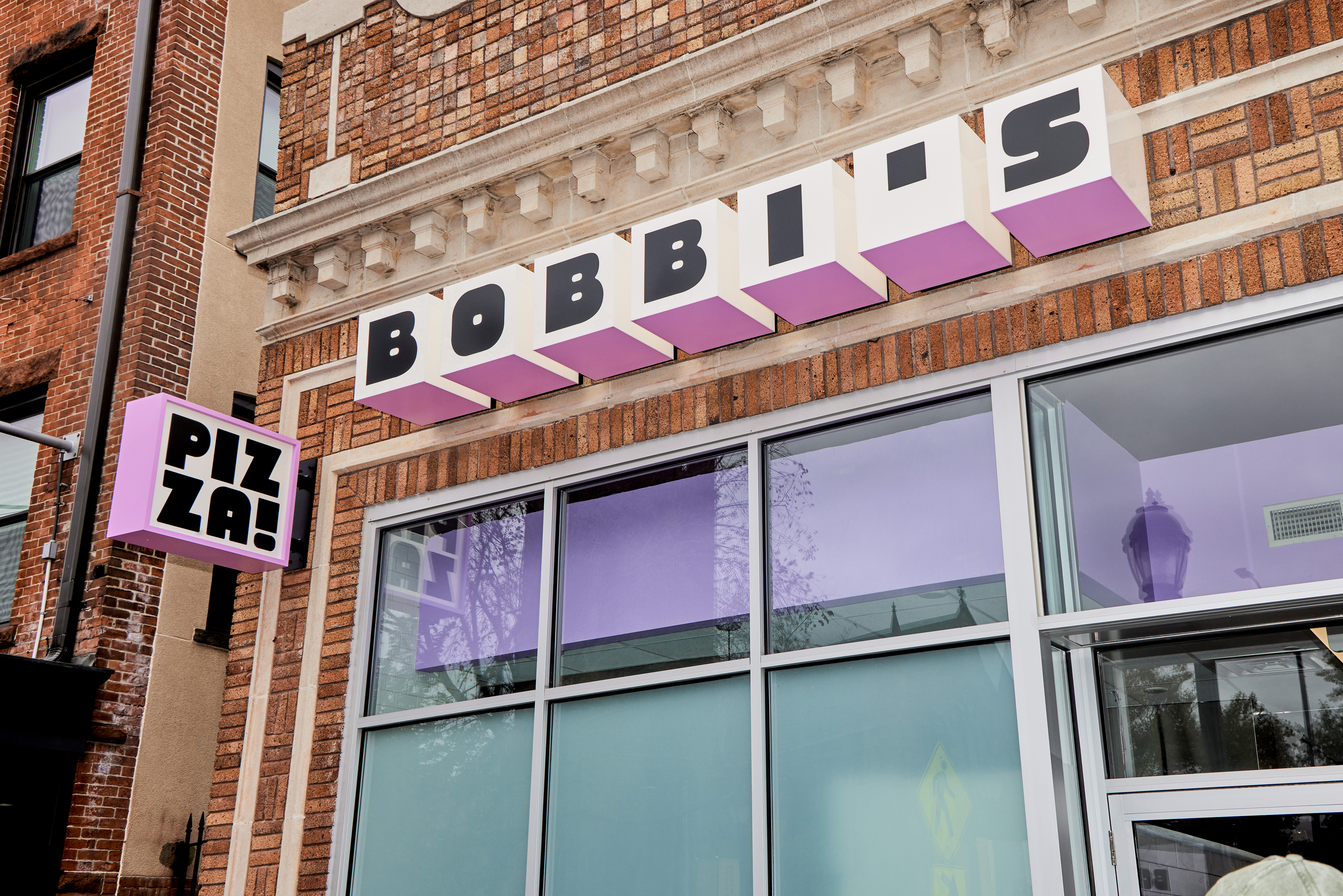
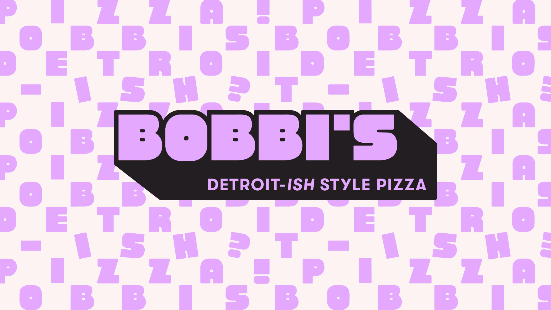
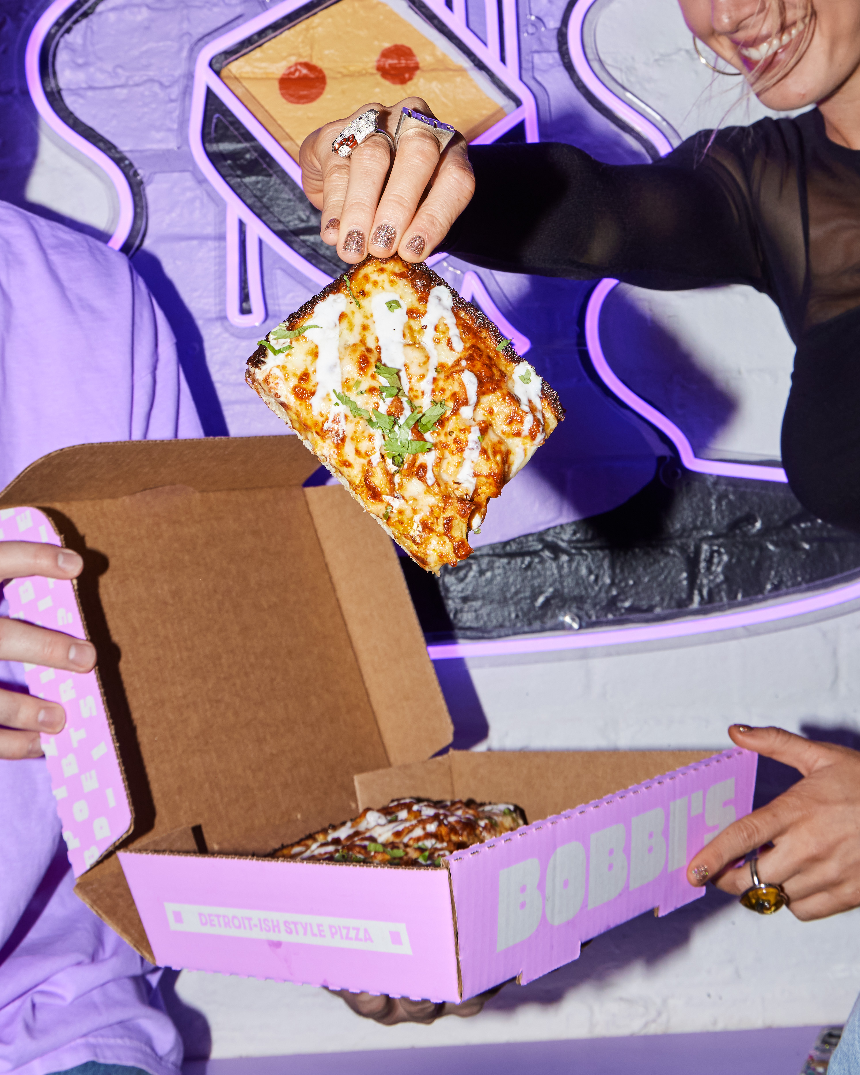
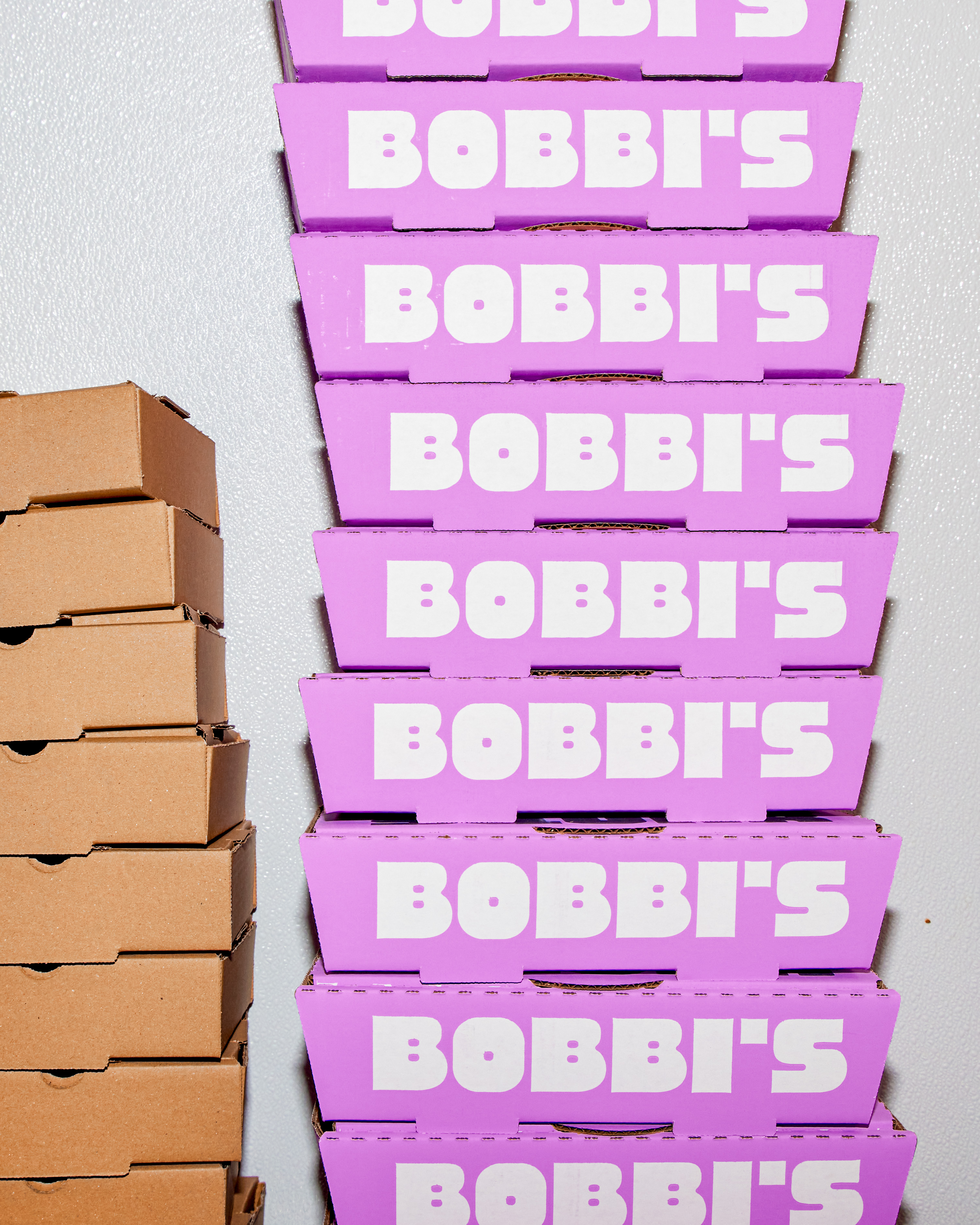
Bobbi's
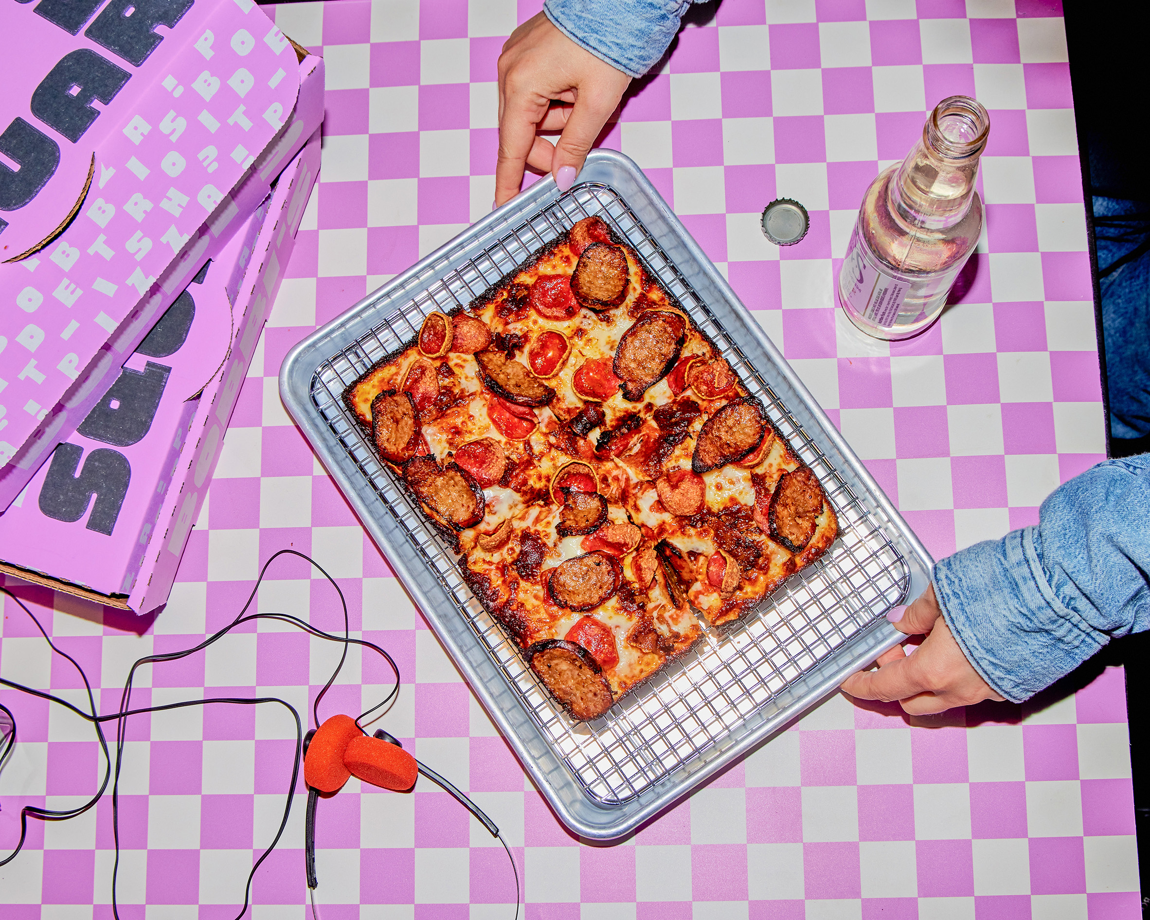
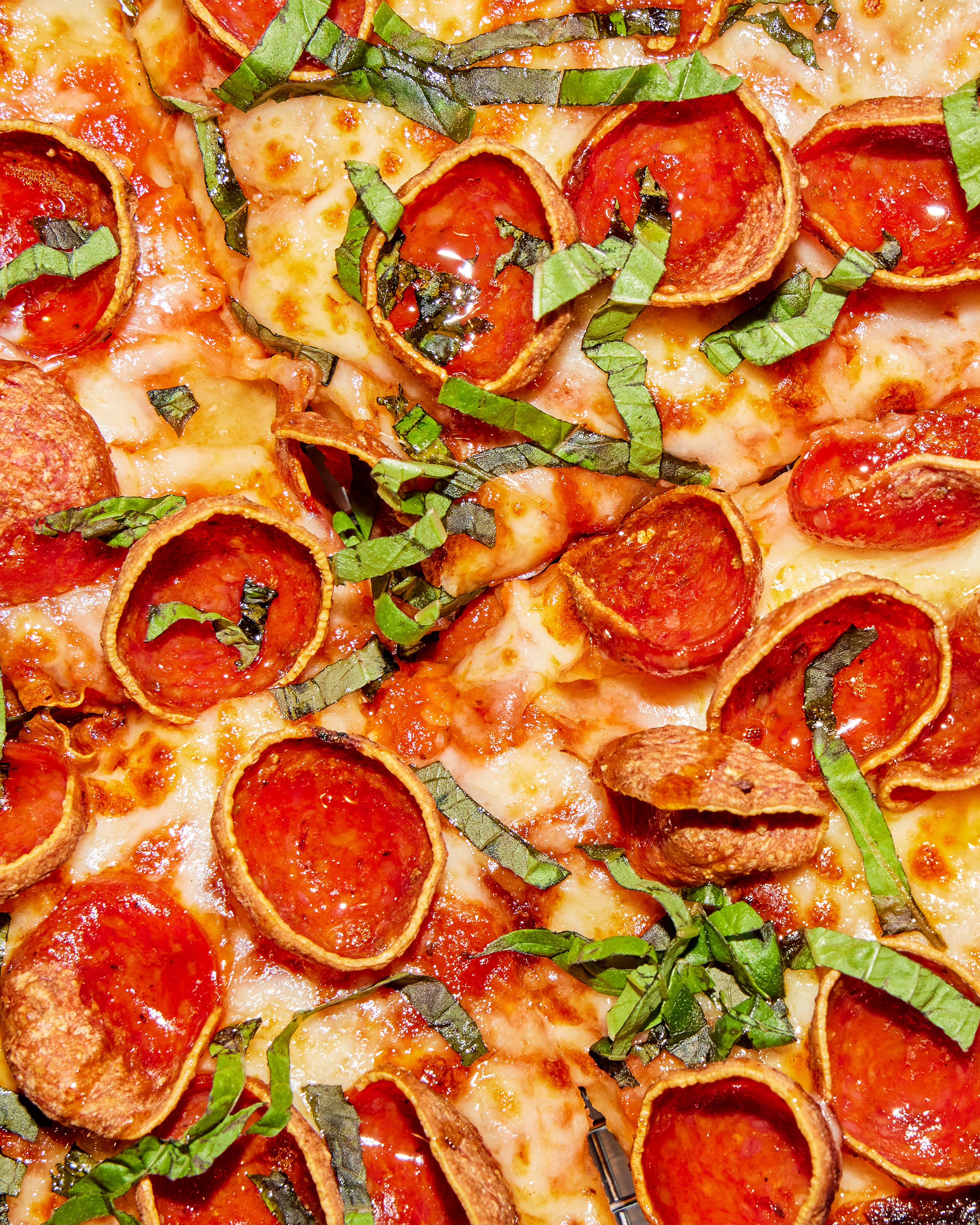
A new concept by the team behind Sherkaan Indian Street Food, Bobbi’s Detroit-ish Style Pizza was built to disrupt. In a city known for historic pizzerias, pitching anything non-traditional feels like a non-starter. With toppings like butter chicken, mushroom confit, and za’atar, we developed an out-there identity that would stand out as much as their flavor profile.
The Adventure.
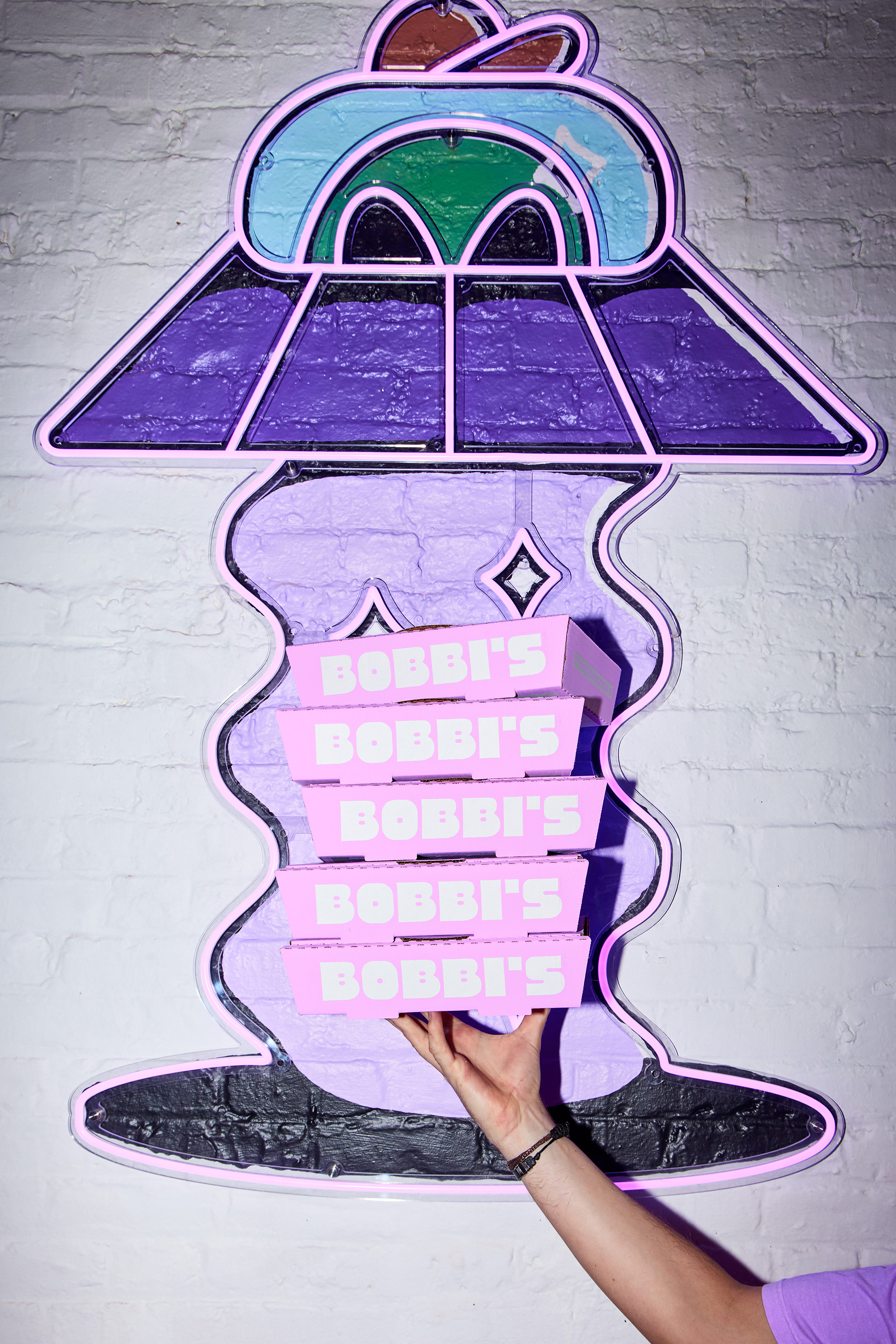
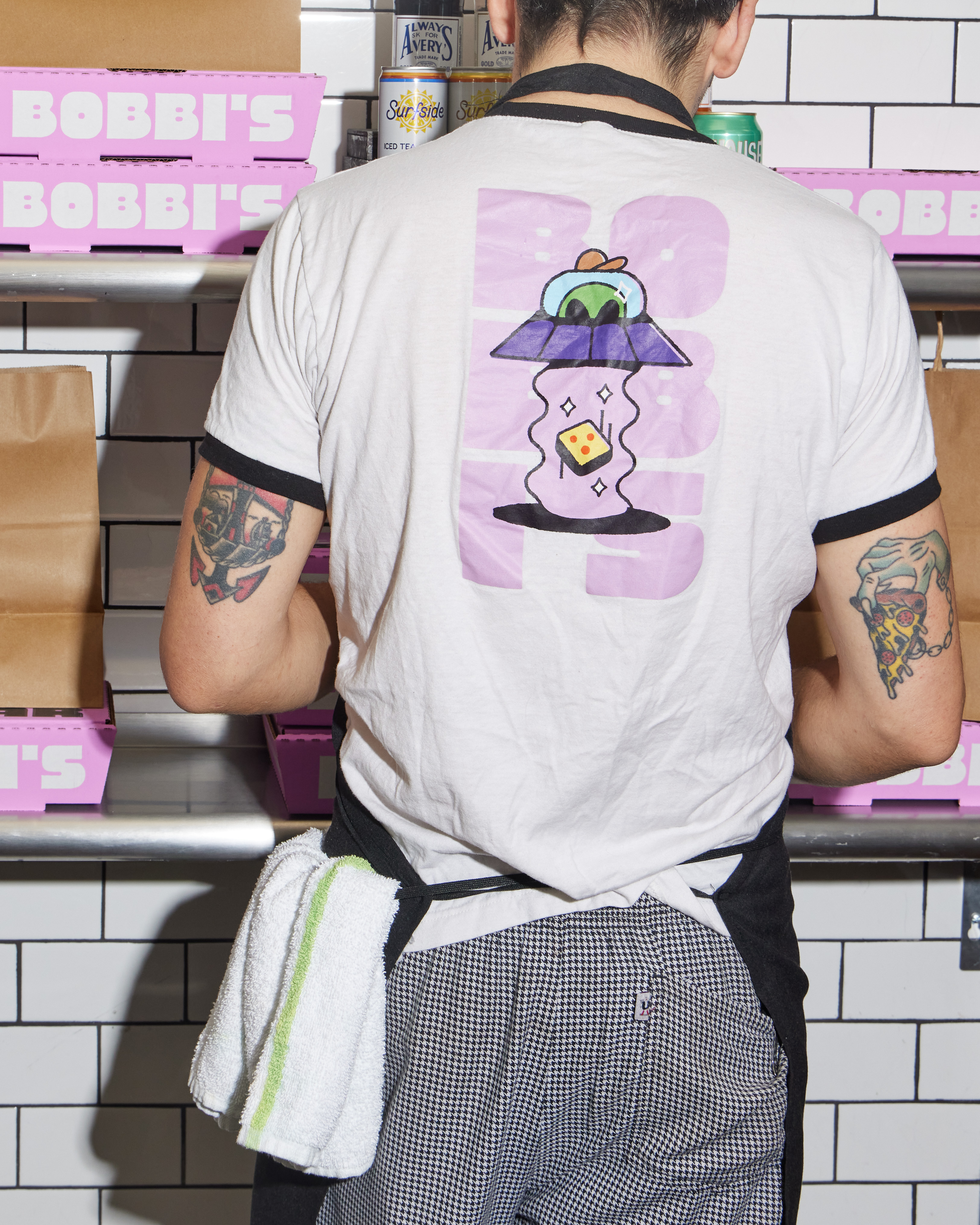
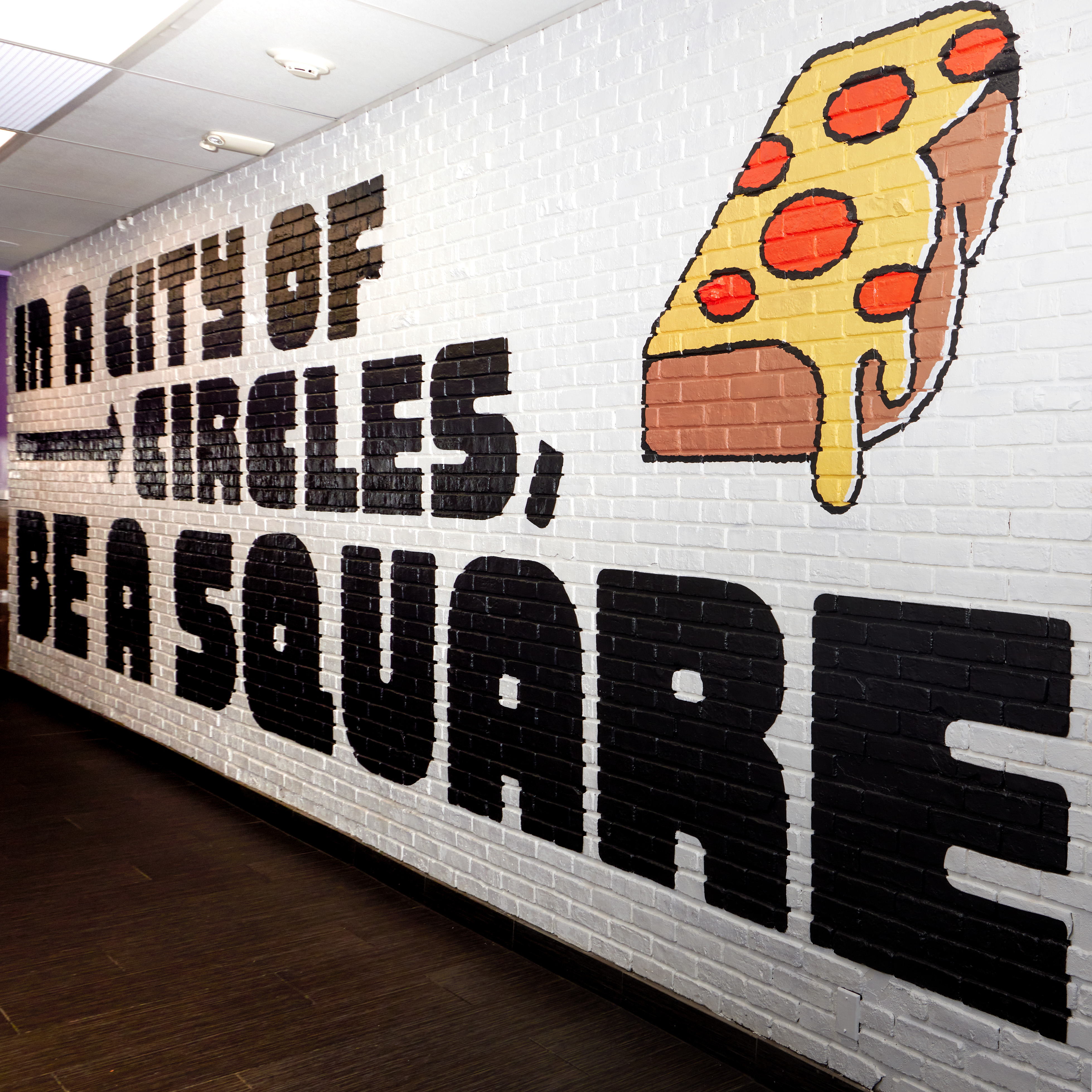
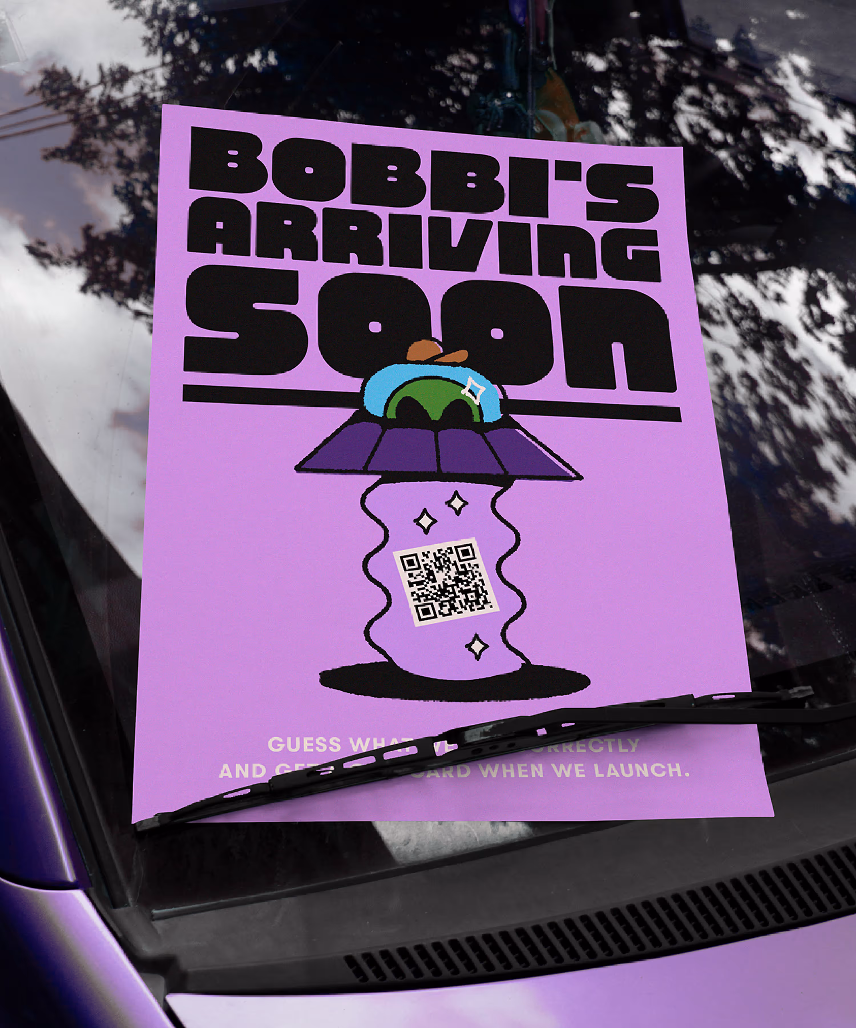
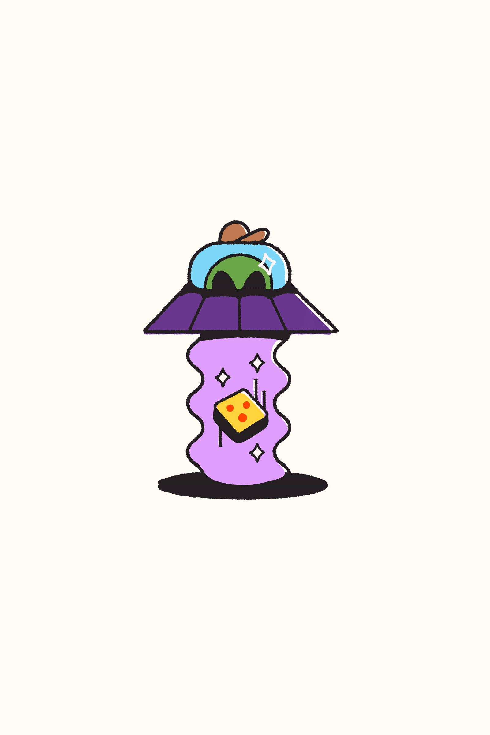
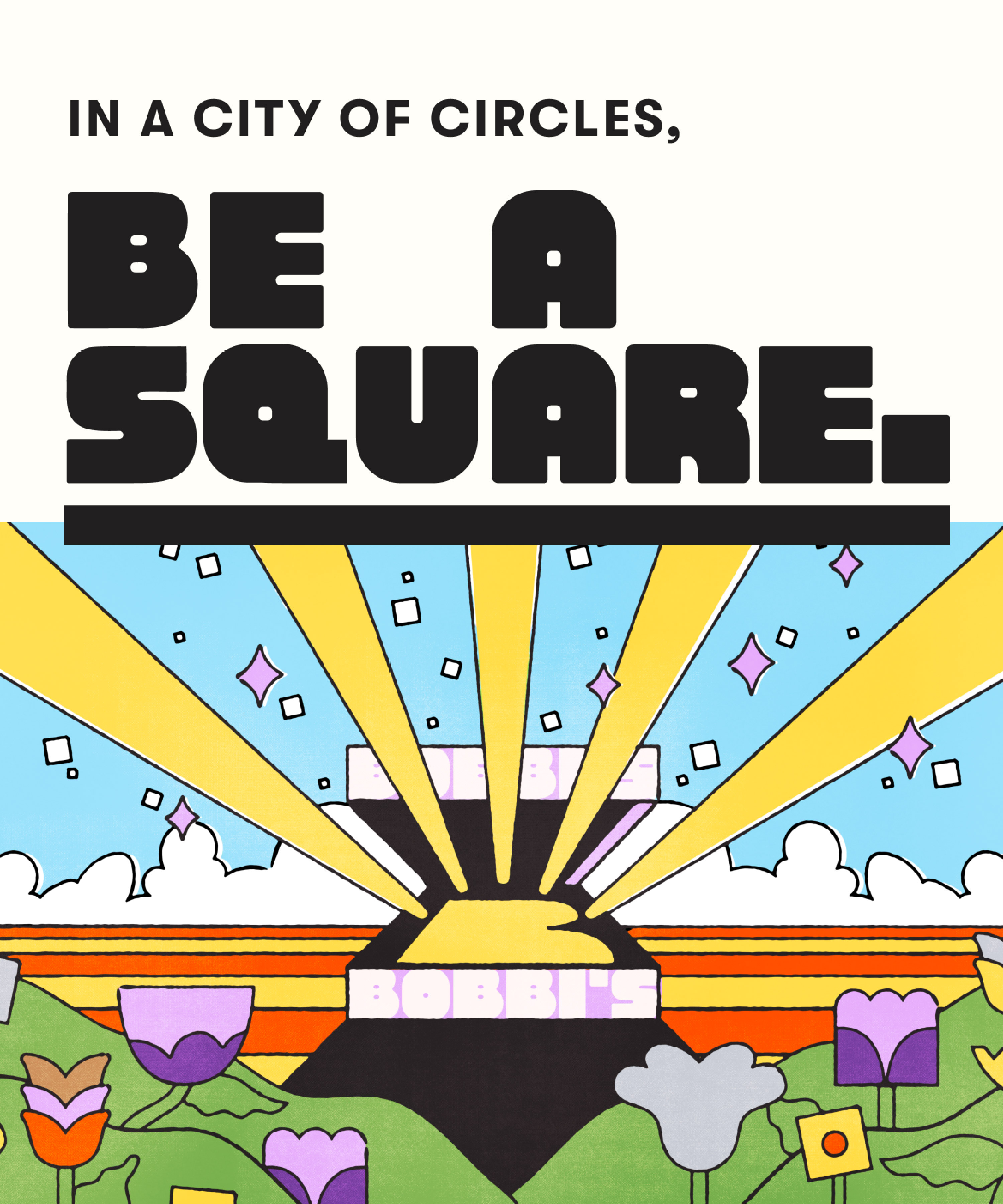
Inspired by the restaurant’s namesake, the head chef’s "funky purple lady" mom, a vibrant lilac shines throughout the brand. Illustrations and custom type both shine a light on the slices’ form factor, but also the quirky personality and adventure at the brand’s core.
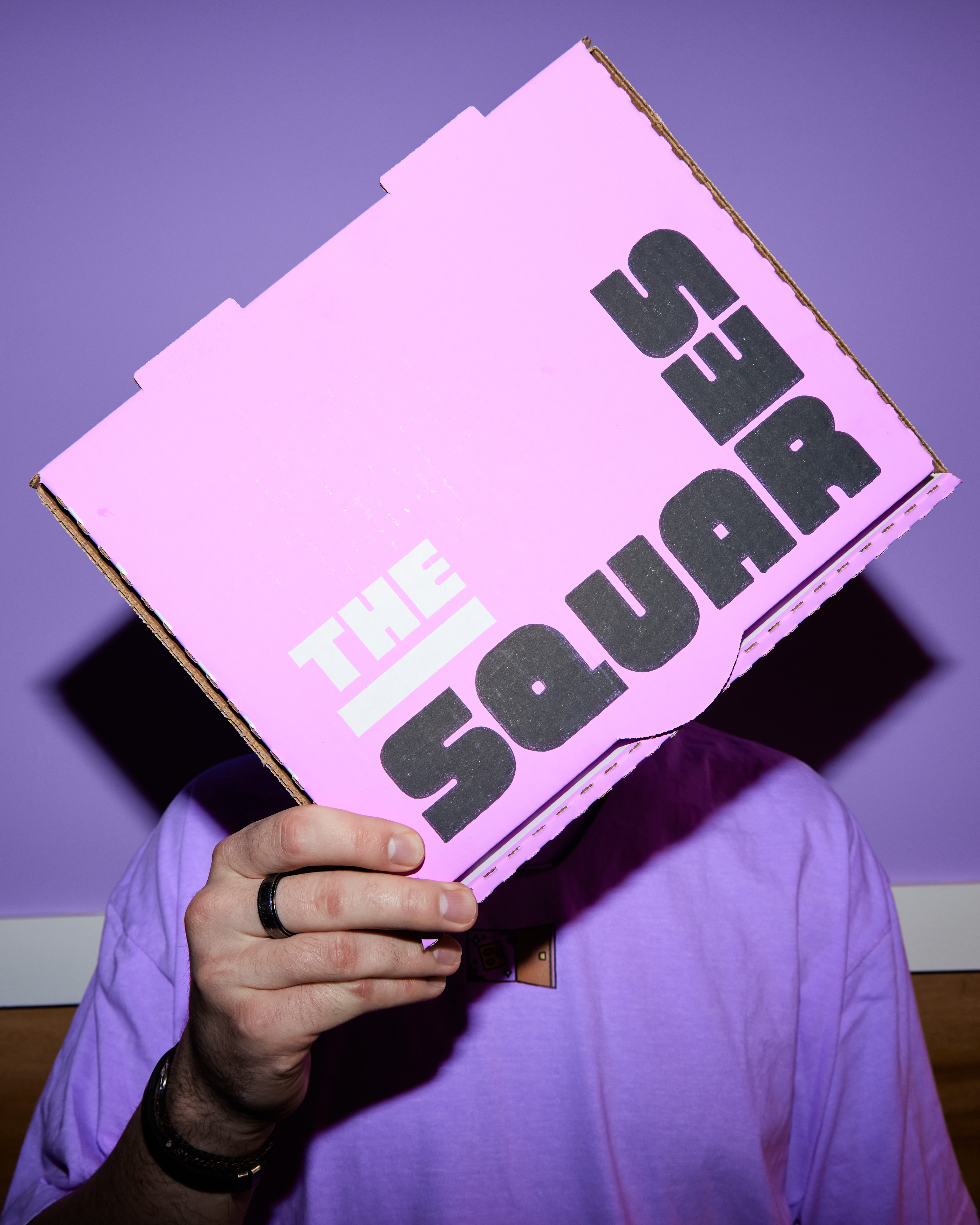
When developing the brand, it became clear that driving home the brand’s retro vibe and bringing out the pizza’s geometry was going to be a challenge. To find a solve for this, instead of using a foundry font, we developed Huey Display, Bobbi’s bespoke typeface. Inspired as much by Duck Hunt as it was Detroit pizza, this font allows even the simplest of merch opportunities to feel branded and ownable.
To bring the vibrancy of the restaurant’s namesake into the brand, we landed on a 1970s-meets-2020s illustration style that could suit an arcade cabinet or a sick graphic tee. A secondary color palette was developed specifically for the illustration set, giving the brand a wider array of hues while keeping the core brand clean and consistent. Playing into stories of Bobbi being a biker, the student demo at Bobbi’s core, and old cartoon tropes, these illustrations deepen the core idea behind the restaurant: that Bobbi’s is about the adventure.