Restaurant Rebrands That Got It Right, and Why They Did It
Rebranding can be a dirty word, especially after so many failed launches. However sometimes it's clear that there needs to be a shake-up, and we've captured three success stories all sparked for different reasons.
To Revive an Aging Staple
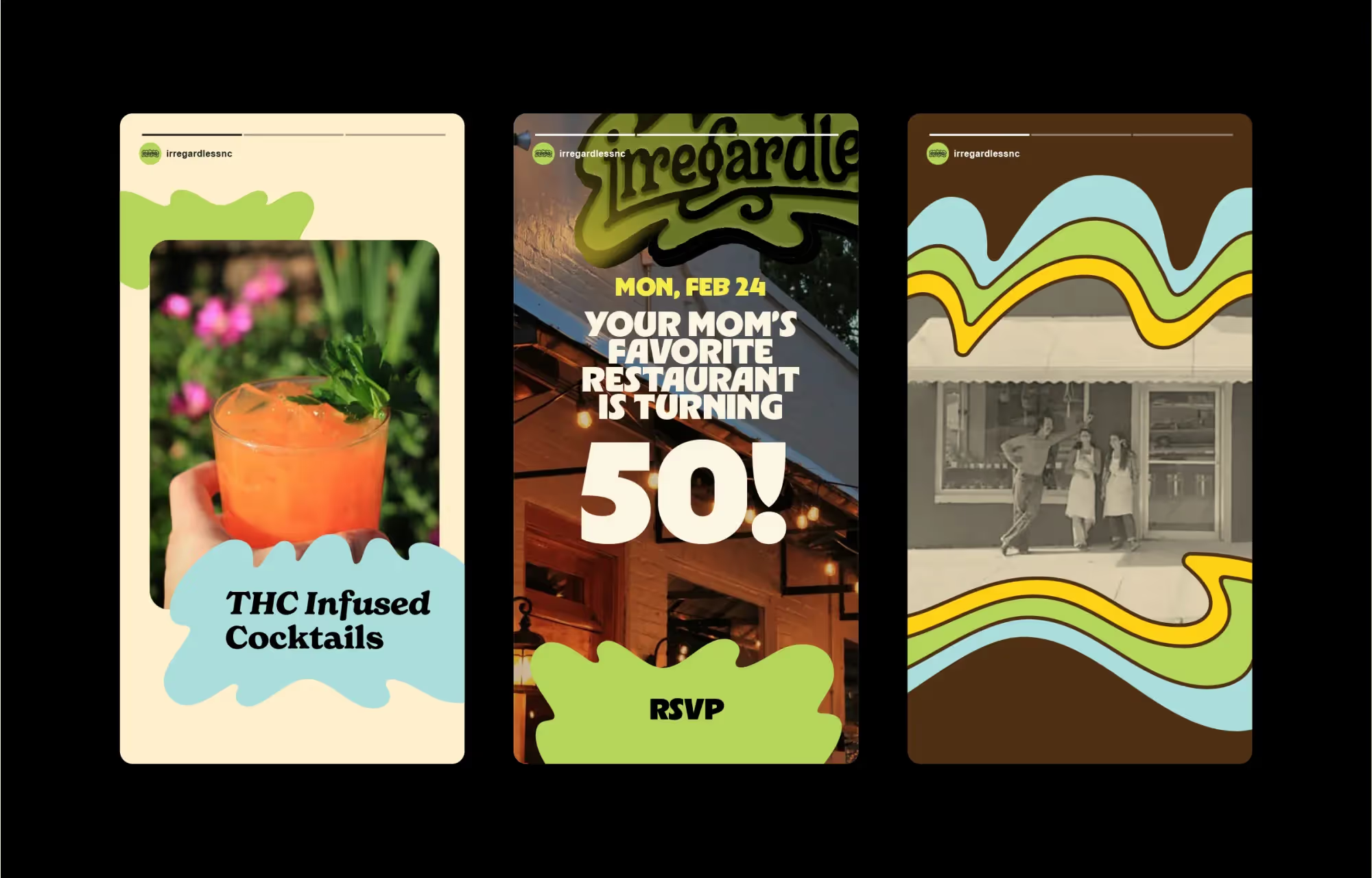
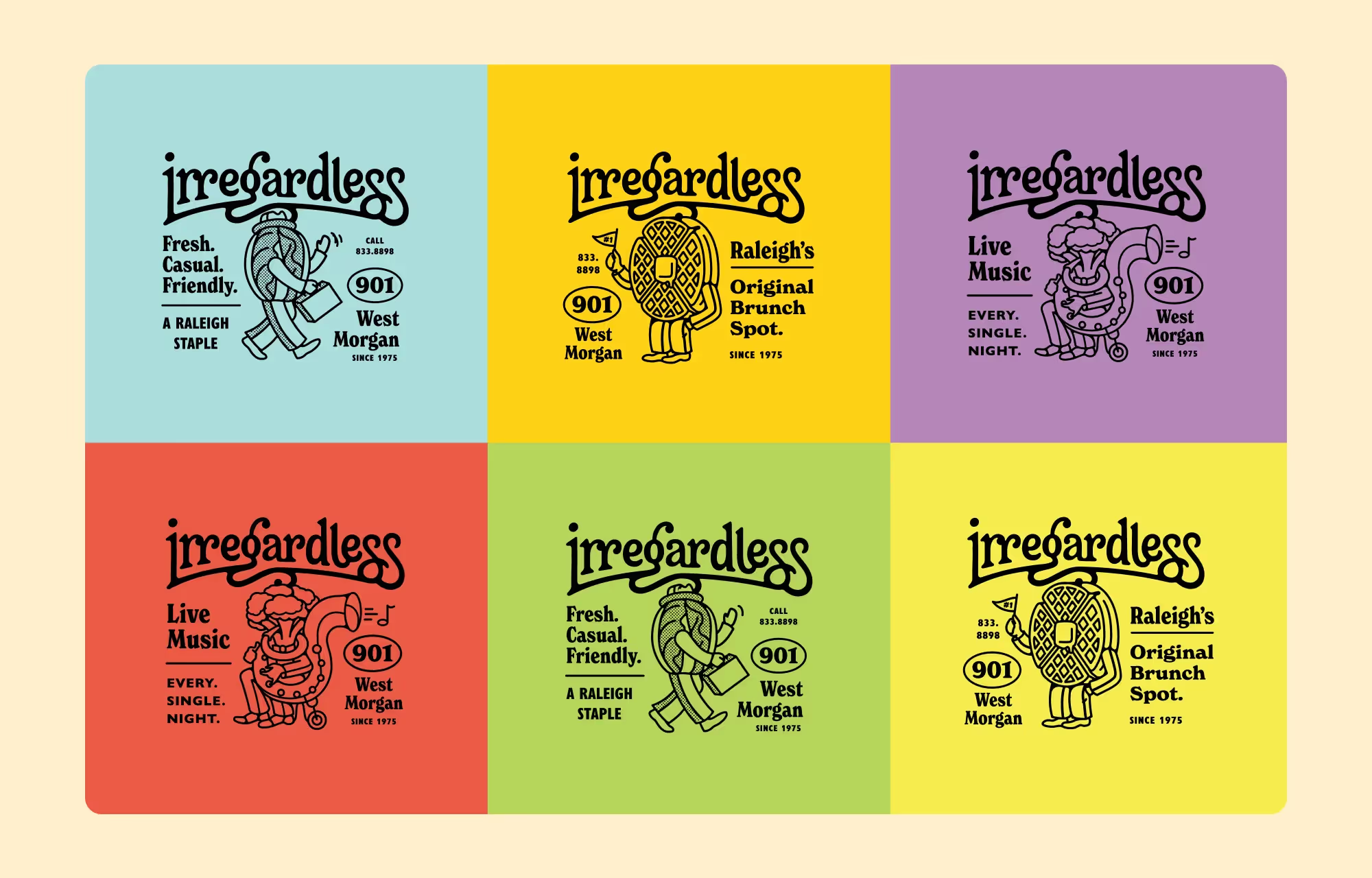
Irregardless has been a Raleigh brunch staple for 50 years, yet over that time, their original funk had faded a bit. Working with MRC Design, their rebrand doesn’t try to corporatize or whitewash the vintage establishment. Rather, they bring more flair and personality through a full illustration set, vibrant colors, and friendly typography. Leaning into what made the concept a staple in the first place, the rebrand shouts the concept’s identity to both customers who’ve visited for generations and to new customers who would’ve overlooked it otherwise. Full Case Study.
To Go Beyond The Trends

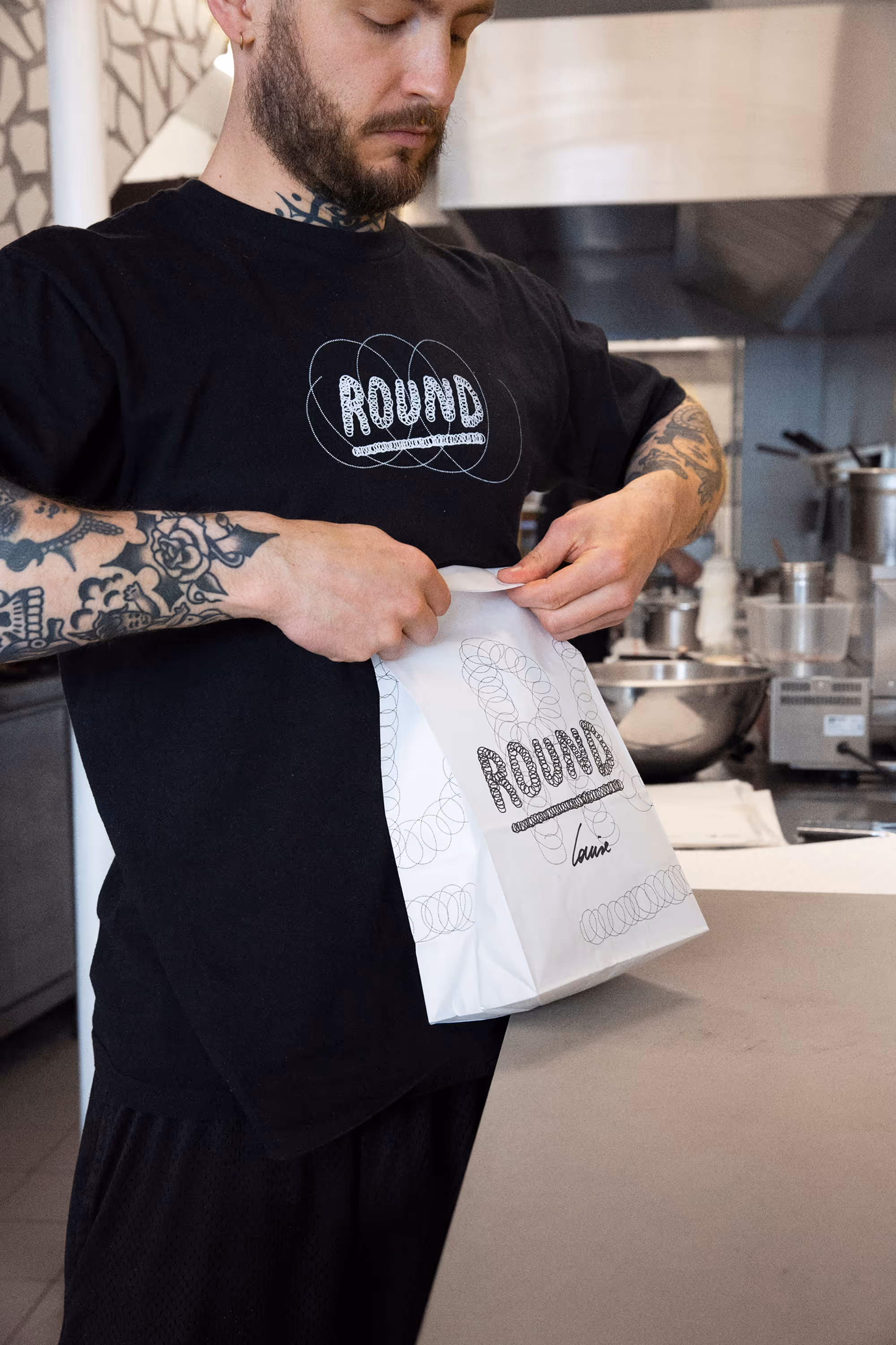
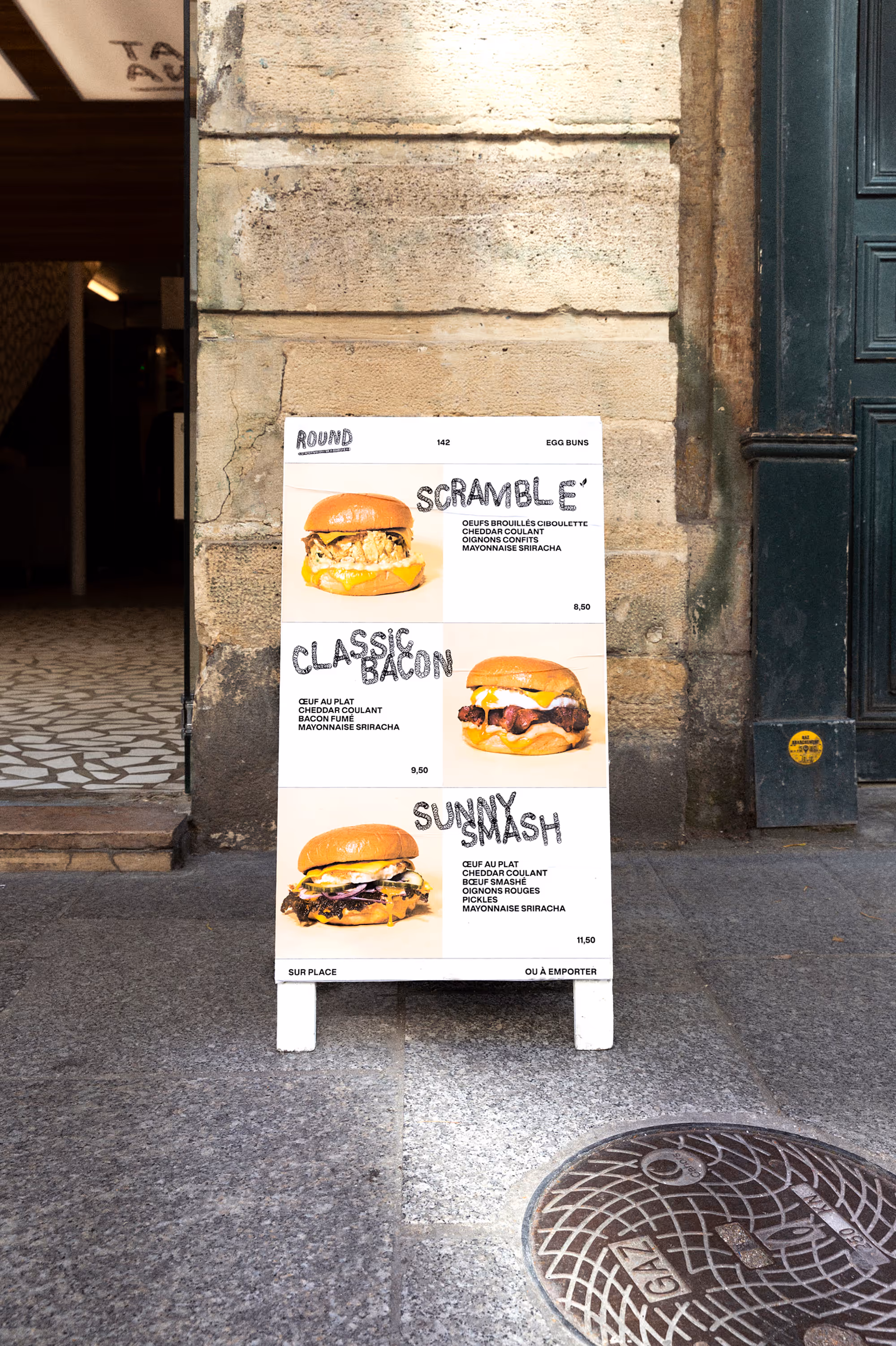
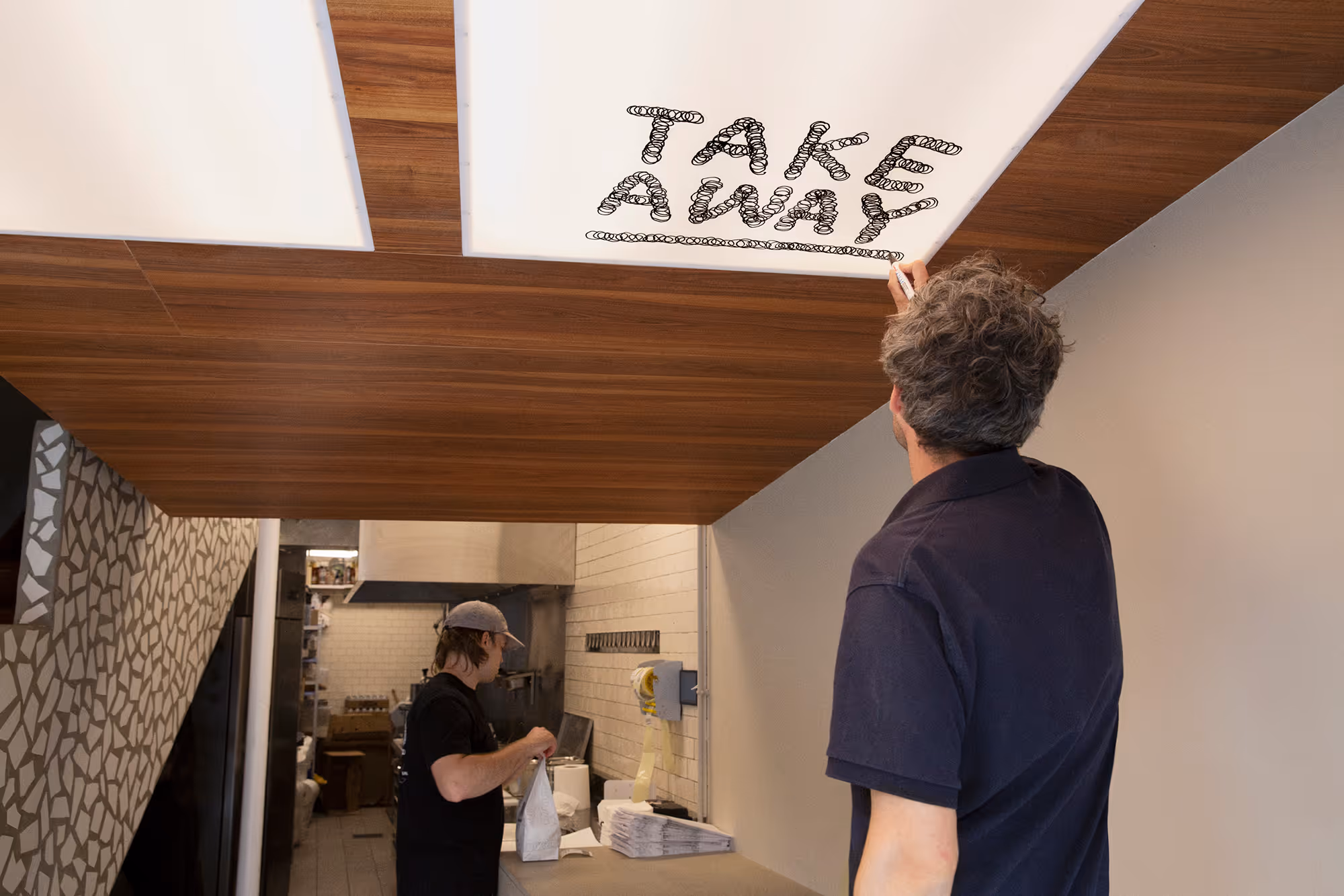
Round Egg Buns, in contrast, was founded in 2021 in Paris, France. In the age of Pinterest inspiration and quick Canva templates, it’s easier than ever to brand a restaurant, often at the cost of originality. However with that comes the side effect of easily leaning into trend rather than strategy. Though the chunky retro-inspired script is fun and approachable, it didn’t stand out among the competition, leaving the brand as a follower and not a leader.
In comes their rebrand designed by Pierre de Belgique, completely going against the grain and focusing directly on the concept. With loose hand-drawn typography boldly applied throughout, every inch of Round’s rebrand is clear and consistent in its personality. Each circle represents both the brand name itself, but also the beating of eggs and skateboard tricks. Words hand-drawn across the store’s interior give the fast-casual spot more craft than a safer option, and let the customer know that this spot isn’t any ordinary spot. The new visual identity feels hand-crafted, rebellious, and unmistakably unique.Full Case Study.
To Grow Beyond Your First Location

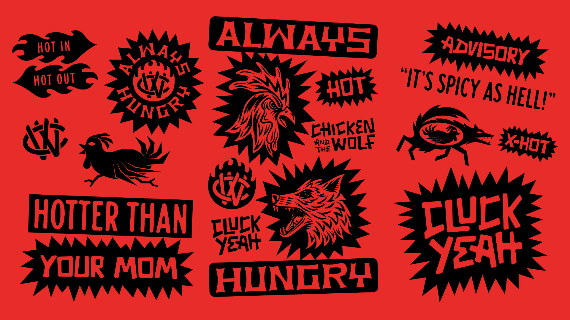
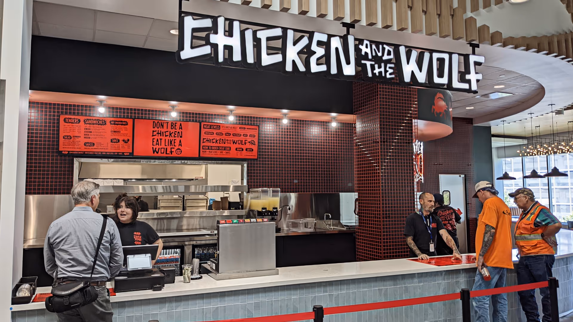
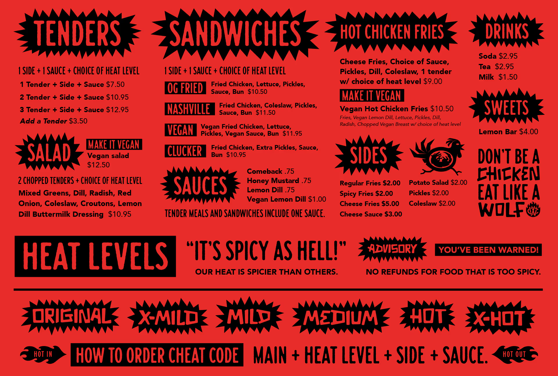
Chicken and The Wolf had a brand that functioned for what it was, a quick-service concept based out of two food halls in Tulsa, OK. However, once leaving the food hall, the concept and brand needed to grow or else. Limited assets beyond a logo and a color palette meant that full interiors could be inconsistent, signage would be plain, and the overall concept would suffer.
In comes Brethren Design Co to develop a full package built for expansion. Rather than playing it safe, the rebrand leans fully into what makes the restaurant unique and revs it to full gear.Replacing the more refined and approachable type and colors with vibrant red and fully-custom graffiti-esque type feels like a full 180, and it is. However, with competition from major chains and other local spots, it pays to own your personality in a crowded landscape. A great restaurant rebrand doesn't just refresh your current look; it should feel like how you always should've. Full Case Study.